
LotteryPlus: Buying the lottery online, made easy for people who aren't at home with apps.ซื้อลอตเตอรี่ออนไลน์ ให้ง่ายสำหรับคนที่ไม่ถนัดเทคโนโลยี
LotteryPlus: buy the government lottery online. Search a ticket by its exact number, drop it in the cart and pay, instead of walking stall to stall.ลอตเตอรี่พลัส: ซื้อสลากกินแบ่งรัฐบาลออนไลน์ ค้นหาเลขที่ต้องการ หยิบใส่ตะกร้า แล้วจ่ายเงิน แทนที่จะต้องเดินหาทีละแผง
Lottery E-commerce Platformแพลตฟอร์มอีคอมเมิร์ซสลาก · 7 Solutions
- Toolsเครื่องมือ
- Screensหน้าจอที่ออกแบบ
- Web (mobile + desktop)
The case, in a short filmเคสนี้ในฟิล์มสั้น








How I workedผมทำงานยังไง
Who did what, step by step. The highlighted lane is mine.ใครทำอะไร ในแต่ละขั้น เลนที่ไฮไลต์คือส่วนของผม
Who did what, a step a card: swipe through. The highlighted rows are mine.ใครทำอะไร ขั้นละการ์ด ปัดดูได้ แถวที่ไฮไลต์คือส่วนของผม
01Researchรีเสิร์ช
- LeadAssigns each designer their featuresมอบหมายฟีเจอร์ให้แต่ละคน
- CRM · PO · PMWorking alongsideทำงานร่วมกันSteps 01 to 06ขั้น 01 ถึง 06
- Senior UXWith me, from research to the UIร่วมกับผม ตั้งแต่รีเสิร์ชถึง UISteps 01 to 04ขั้น 01 ถึง 04
- MeผมMy features: their feedback and the flows people got stuck inฟีเจอร์ที่ได้รับมอบหมาย feedback และโฟลว์ที่ผู้ใช้ติด
02Ideas and prototypesไอเดียและต้นแบบ
- MeผมDesign options, prototypedแนวทางการออกแบบ และต้นแบบ
03Testing with usersทดสอบกับผู้ใช้
- MeผมEach option tested with usersทดสอบแต่ละแบบกับผู้ใช้
04The real UIUI ตัวจริง
- LeadReviews the designs, approvesรีวิวงาน และ Approve
- MeผมThe real UI, reviewed with the LeadUI ตัวจริง รีวิวกับ Lead
05Design System V.7
- MeผมStarted it; once steady, handed to the teamเป็นคนเริ่ม พอนิ่งแล้วส่งให้ทีมดูแลต่อ
06Buildพัฒนา
- DevelopersทีมพัฒนาBuilds from the designsพัฒนาตามแบบ
My part of LotteryPlusงานในส่วนของผมใน LotteryPlus
Our team took the web app from version 6 to 7, with a Lead handing out the work and reviewing it. These are the features the Lead assigned to me, each reviewed and approved, and the design system, which I started and, once it was steady, handed to the team to run. At a glance here; seven pieces are told in full below.ทีมเราพาเว็บแอปจากเวอร์ชัน 6 สู่ 7 โดยมี Lead กระจายงานและรีวิว นี่คือฟีเจอร์ที่ผมได้รับมอบหมาย ซึ่งผ่านการรีวิวและ Approve กับ Lead และ Design System ที่ผมเป็นคนเริ่ม พอนิ่งแล้วส่งให้ทีมดูแลต่อ ดูแบบทีเดียวตรงนี้ และ 7 เรื่องที่เล่าเต็มด้านล่าง
The whole pictureภาพรวมงานทั้งหมด
Everything I did on this project, one row each. Tap a row for the detail.ทุกอย่างที่ผมทำในโปรเจกต์นี้ แถวละเรื่อง กดเพื่ออ่านรายละเอียด
Everything I did on this project. Swipe through, tap one for the detail.ทุกอย่างที่ผมทำในโปรเจกต์นี้ ปัดดูทีละเรื่อง แตะเพื่ออ่านรายละเอียด
- A new home pageหน้าแรกแบบใหม่ProblemปัญหาFeedback said the home page “wasn't proud”; nobody knew what that meantได้ feedback ว่าหน้าแรก “ไม่พราว” แต่ไม่มีใครรู้ว่าหมายถึงอะไรWhat I didสิ่งที่ทำSplit the work in two, the home page and the set search, each with its own prototype and test, then merged them; redrew the random button as a helperแยกงานเป็นสองส่วน หน้าแรกกับการค้นหาหวยชุด ทำต้นแบบและทดสอบแยกกัน แล้วรวมเป็นเวอร์ชัน final พร้อมปุ่มสุ่มตัวเลขแบบใหม่ที่เป็นเหมือนผู้ช่วยResultผลลัพธ์Header 3 went into the final: 6.93 of 7, against 6.4ส่วนหัวแบบที่ 3 ได้ไปต่อ: 6.93 จาก 7 เทียบกับ 6.4
- Finding a setค้นหาหวยชุดProblemปัญหาBuyers typed the number into the wrong box and never said how many ticketsคนกรอกเลขผิดช่อง และไม่ได้ระบุจำนวนชุดWhat I didสิ่งที่ทำTested three designs with the same five people; carried the best two forward, combinedทดสอบ 3 แบบกับผู้ใช้ 5 คนเดิม แล้วรวม 2 แบบที่ดีที่สุดไปต่อResultผลลัพธ์100% task success · satisfaction 3.83 → 6.76 of 7ทำสำเร็จ 100% · ความพึงพอใจ 3.83 → 6.76 จาก 7
- Getting through sign-upสมัครสมาชิกให้ผ่านProblemปัญหา20% of sign-ups failed: above the usual 10–15%สมัครไม่สำเร็จ 20% สูงกว่าปกติที่ 10–15%What I didสิ่งที่ทำSplit sign-up into a required page and a skippable one; moved the bank account to the skippable pageแยกเป็นหน้าบังคับกับหน้าที่ข้ามได้ และย้ายบัญชีธนาคารไปหน้าที่ข้ามได้Resultผลลัพธ์Once live: 15% more people finished sign-upหลังขึ้นจริง: คนสมัครสำเร็จเพิ่มขึ้น 15%
- Checking your ticketตรวจสลากProblemปัญหาThe old page asked for the draw first, then three number boxes: many choices, a lot to think aboutแบบเดิมให้เลือกงวดก่อน แล้วมีช่องกรอกเลข 3 ช่อง ตัวเลือกเยอะ ทำให้คิดเยอะWhat I didสิ่งที่ทำThe number first: tap and type; two more boxes and the draw open out, set to the current drawให้เลขมาก่อน แตะแล้วพิมพ์ได้ทันที อีก 2 ช่องและการเลือกงวดกางออกมาให้ โดยตั้งเป็นงวดปัจจุบันไว้แล้วResultผลลัพธ์More people check their tickets, and more of them arrive from Googleคนใช้ตรวจสลากมากขึ้น และคนเข้าจาก Google มากขึ้น
- Adding a bank account, laterบัญชีธนาคาร กรอกทีหลังได้ProblemปัญหาChanging an account went through the help center: a long form and a photo of the bank bookการแก้บัญชีต้องผ่านศูนย์ช่วยเหลือ กรอกฟอร์มยาว และแนบรูปหน้าสมุดบัญชีWhat I didสิ่งที่ทำFollowing the new sign-up: add the account yourself whenever you're ready; to change it, one button to staff on LINEต่อจากการสมัครแบบใหม่ ครั้งแรกกรอกเองได้ทุกเมื่อ ถ้าจะแก้ กดปุ่มเดียวคุยกับเจ้าหน้าที่ทาง LINEResultผลลัพธ์A short form, a check before saving, and changes handled where the team already worksฟอร์มสั้น มีขั้นยืนยันก่อนบันทึก และการแก้ไขที่ทีมดูแลในช่องทางที่ใช้อยู่แล้ว
- The help centerศูนย์ช่วยเหลือProblemปัญหาCustomers reported problems in two places, often under the wrong category, through many stepsลูกค้าแจ้งปัญหา 2 ช่องทาง เลือกหมวดหมู่ไม่ตรง และขั้นตอนเยอะWhat I didสิ่งที่ทำCut the categories and the forms: one page, straight to staff on LINE or a callตัดหมวดหมู่และฟอร์มออก เหลือหน้าเดียว ไปคุยกับเจ้าหน้าที่ทาง LINE หรือโทรได้เลยResultผลลัพธ์Fewer steps for customers, and CRM handles each case onceลูกค้าทำน้อยขั้นลง และ CRM ดูแลแต่ละเรื่องแค่ครั้งเดียว
- Design System V.7ProblemปัญหาThe organisation had no shared, systematic design system yet, and version 7 needed one that could scaleองค์กรยังไม่มี Design System ที่เป็นระบบร่วมกัน และเวอร์ชัน 7 ต้องการระบบที่รองรับการ scaleWhat I didสิ่งที่ทำPushed for it (a vote, a pitch, advice to the team), then set it up myself: primitive > semantic > component, one naming rule throughout, and the V.6 components rebuilt on itผลักดัน เปิดโหวต นำเสนอ และปรึกษาทีม แล้วเซ็ตเองทั้งหมด โครงสร้าง Primitive > Semantic > Component ตั้งชื่อด้วยกติกาเดียวกันทั้งระบบ และปรับคอมโพเนนต์จาก V.6 มาอยู่บนระบบใหม่Resultผลลัพธ์Steady enough to hand to the team; I stay on as its design-system advisorนิ่งจนส่งต่อให้ทีมดูแลได้ และผมยังเป็นที่ปรึกษา Design System ให้ทีม
Part 1ตอนที่ 1
A new home pageหน้าแรกแบบใหม่
From “not proud” to a home page that leads with the search.จาก “ไม่พราว” สู่หน้าแรกที่ให้การค้นหานำหน้า
Contextบริบท
It began with one line of feedback on the home page: “ฟังค์ชั่นไม่พราวครับ”, the function isn't proud. With a senior UX designer I traced it to two things, the home page and the set search, and ran them as two tracks, each prototyped and tested with users, then merged into one final.ทุกอย่างเริ่มจาก feedback หนึ่งประโยคบนหน้าแรก: “ฟังค์ชั่นไม่พราวครับ” ผมกับ Senior UX ไล่หาจนเจอว่าเป็นสองเรื่อง คือหน้าแรกกับการค้นหาหวยชุด จึงแยกเป็นสองงาน ทำต้นแบบและทดสอบกับผู้ใช้แยกกัน แล้วรวมเป็นเวอร์ชัน final
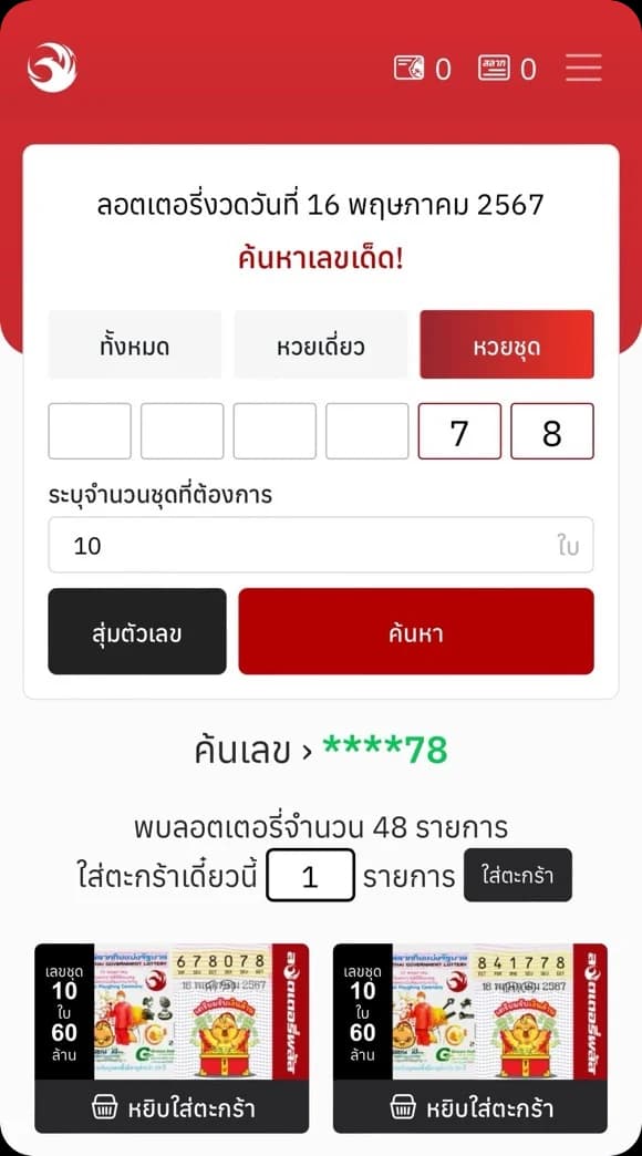
The feedback that started it: “ฟังค์ชั่นไม่พราวครับ”feedback ที่เป็นจุดเริ่มต้น: “ฟังค์ชั่นไม่พราวครับ” How it was worked outวิธีทำงาน
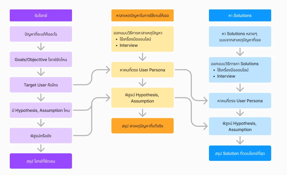
A way of working that a senior UX designer on the team helped shape and coached us through. Both tracks followed it: the brief, the real cause, then solutions, each step proven with usersวิธีทำงานที่ Senior UX ในทีมช่วยออกแบบและแนะนำ ทั้งสองงานใช้วิธีนี้: รับโจทย์ หาสาเหตุจริง แล้วหา Solution ทุกขั้นพิสูจน์กับผู้ใช้ Defining itนิยามโจทย์
First: what would “proud” look like? We wrote it out on sticky notes and sorted them into three wants.ก่อนอื่นต้องรู้ว่า “พราว” หน้าตาเป็นยังไง เราเขียนออกมาเป็นโน้ต แล้วจัดเป็นสามเรื่องที่อยากได้
Eye-catchingน่าดึงดูด
- Something that moves, to draw the eyeมีลูกเล่น หรือ animation เคลื่อนไหว เพื่อดึงดูดสายตา
- A colour or a size that stands out from the rest of the pageสีที่เด่นกว่าสีอื่นในหน้า หรือ layout และ element ที่ใหญ่
- A hierarchy that leads the eyeVisual hierarchy ที่นำสายตา
- Shadows that give the input boxes depthเงาหรือไล่ระดับ ให้ช่องป้อนข้อมูลดูมีมิติ
Memorableน่าจดจำ
- UI that stands apart from everything else on the pageUI ที่เด่น หรือแตกต่างจาก element อื่นในหน้า
- Familiar picturesภาพที่คุ้นตา
- Symbols: icons or picturesสัญลักษณ์ภาพ: ไอคอนหรือรูปภาพ
Easy to find your wayง่ายต่อการนำทาง
- Few taps, little timeกดน้อย ใช้เวลาน้อย
- UI people already use every day: one look and they know what to doใช้ UI แบบแอปที่ทุกคนใช้ทุกวัน เห็นแล้วรู้เลยว่าต้องทำอะไร
- Everything in one place: no new page, nothing layered on topทุกอย่างอยู่ที่เดียว ไม่ต้องเปลี่ยนหน้า ไม่มีอะไรขึ้นซ้อน
- Little text, clear labelsข้อความน้อย ป้ายชัดเจน
Pink: my notesสีชมพู: โน้ตของผมBlue: the team'sสีฟ้า: โน้ตของทีม
Then the search, worked through three ways, every case in each: all, single and set; the results for a front-3, back-3 or back-2 number; nothing typed; and what to suggest when nothing is close.จากนั้นออกแบบการค้นหาทั้งโฟลว์ สามแบบ แต่ละแบบครบทุกกรณี: ค้นหาทั้งหมด เดี่ยว และชุด ผลลัพธ์เมื่อค้นเลข 3 ตัวหน้า 3 ตัวท้าย หรือ 2 ตัวท้าย กรณีไม่พิมพ์อะไรเลย และลอตเตอรี่แนะนำเมื่อไม่มีเลขใกล้เคียง
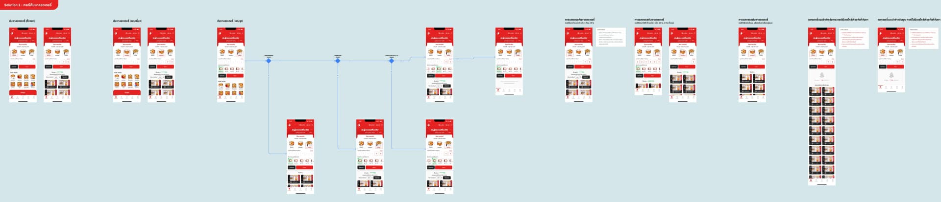
Decision & trade-offการตัดสินใจ และสิ่งที่แลก
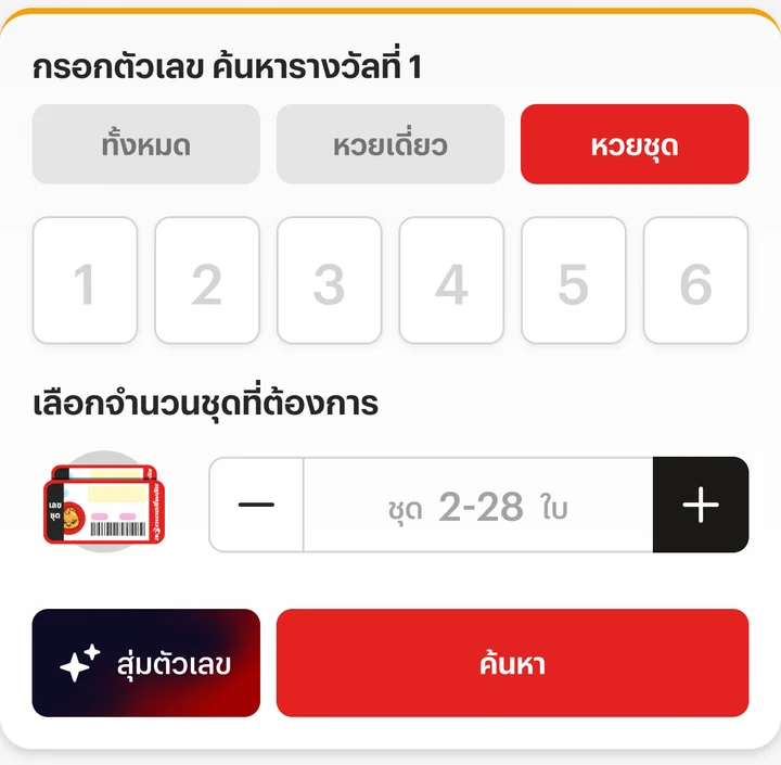
Two headers for the same search box went to users; both put the digits 1 to 6 in the search boxes, so each digit has its place.ส่วนหัวสองแบบของกล่องค้นหาเดียวกัน ไปทดสอบกับผู้ใช้ ทั้งสองแบบเพิ่มเลข 1 ถึง 6 ในช่องค้นหา ให้รู้ว่าแต่ละหลักอยู่ตรงไหน
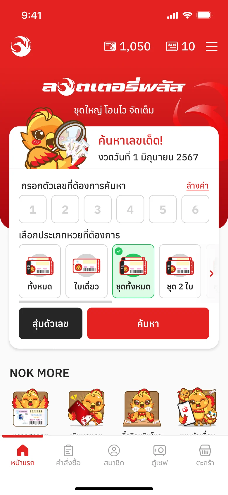
1Header 1: the mascot, searchingส่วนหัวแบบที่ 1: น้องจิ๊ดริดกำลังค้นหาเลข
Satisfaction 6.4 / 7ความพึงพอใจ 6.4 / 7
- Likedชอบ: The search stands out: a big mascot looking for a numberส่วนค้นหาโดดเด่นขึ้น ด้วยจิ๊ดริดตัวใหญ่ที่กำลังค้นหาเลข
- Likedชอบ: The ticket-type tabs cut, since few people tapped them; the type is picked belowตัดแท็บประเภทหวยออก เพราะคนแทบไม่กด แล้วไปเลือกประเภทด้านล่างแทน
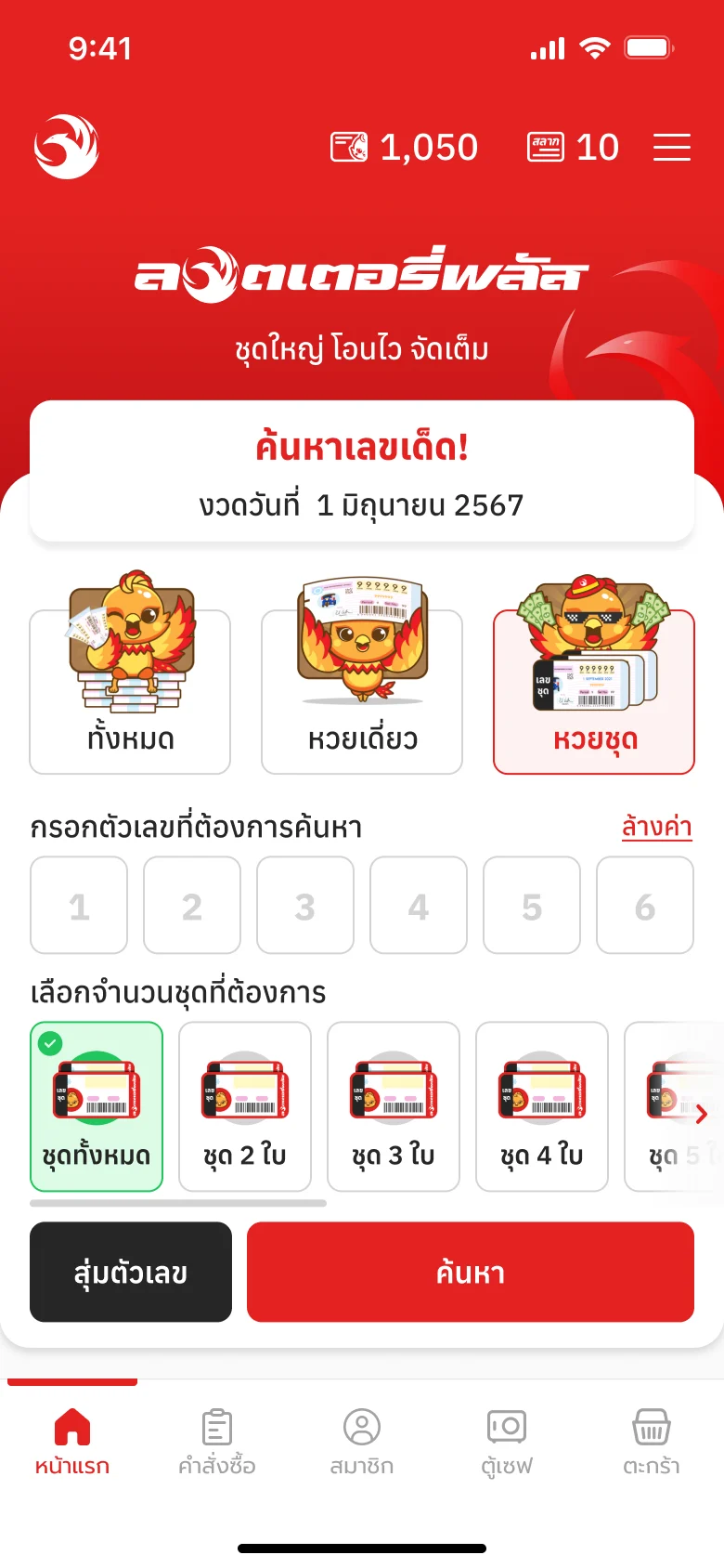
3Header 3: the title and the draw's dateส่วนหัวแบบที่ 3: หัวข้อและวันที่ของงวด
Satisfaction 6.93 / 7ความพึงพอใจ 6.93 / 7
Carried forwardได้ไปต่อ
- Likedชอบ: The search stands out: “ค้นหาเลขเด็ด” and the draw's dateส่วนค้นหาโดดเด่นขึ้น ด้วยคำว่า “ค้นหาเลขเด็ด” และวันที่ของงวด
- Likedชอบ: The three ticket types clearer and easier to tap, each with the brand's mascot, restyledประเภทหวยทั้ง 3 แบบชัดและน่ากดขึ้น มีน้องจิ๊ดริดของแบรนด์ที่ปรับแต่งใหม่ในแต่ละแบบ
Header 3 scored higher and went into the final, its ticket types kept and made clearer rather than cut.ส่วนหัวแบบที่ 3 ได้คะแนนสูงกว่าและได้ไปต่อ โดยเก็บประเภทหวยไว้แต่ทำให้ชัดขึ้น แทนการตัดออก
Validationการพิสูจน์
- Visual appeal (A/B on the heading)ความสวยงาม (A/B ส่วนหัว)+8.55%
Resultผลลัพธ์
An earlier version went live first, with the search in three big tabs; customers weren't used to tabs that mixed ticket types with features, so the final went back to all, single and set. The search leads, and beside it is a new random button made to be tapped: modern, with a sparkle, like an AI helper, where the old one was a plain black button.เวอร์ชันแรกที่ขึ้นจริงแบ่งการค้นหาเป็นแท็บใหญ่ 3 แท็บ แต่ลูกค้าไม่ชินแท็บที่ปนประเภทหวยกับฟีเจอร์ เวอร์ชัน final จึงกลับมาใช้ ทั้งหมด หวยเดี่ยว หวยชุด ให้การค้นหานำหน้า และมีปุ่มสุ่มตัวเลขแบบใหม่ที่ออกแบบให้น่ากด ทันสมัย มีประกายดาว เหมือนผู้ช่วย AI จากเดิมที่เป็นปุ่มสีดำธรรมดา
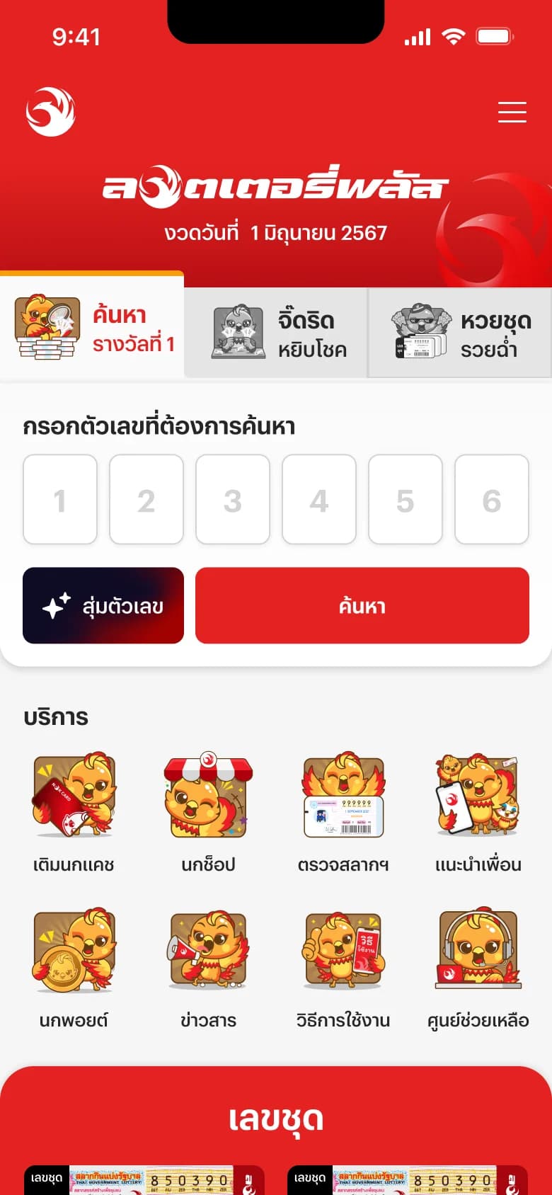
First live: the search in three big tabsเวอร์ชันแรกที่ขึ้นจริง: ค้นหาแบบแท็บใหญ่ 3 แท็บ 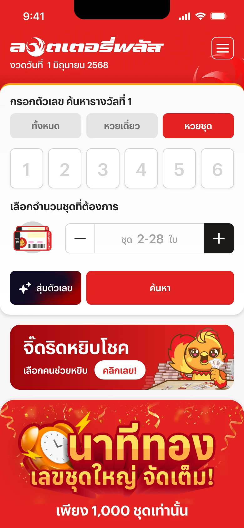
The final home page: a random button that invites a tapหน้าแรก final: ปุ่มสุ่มตัวเลขที่น่ากดขึ้น - The search leads: the draw's date, then “กรอกตัวเลข ค้นหารางวัลที่ 1”การค้นหานำหน้า: วันที่ของงวด แล้วจึง “กรอกตัวเลข ค้นหารางวัลที่ 1”
- Random pick, redrawn so people want to tap it: the old button was plain blackสุ่มตัวเลข ออกแบบใหม่ให้น่ากด จากเดิมที่เป็นปุ่มสีดำธรรมดา
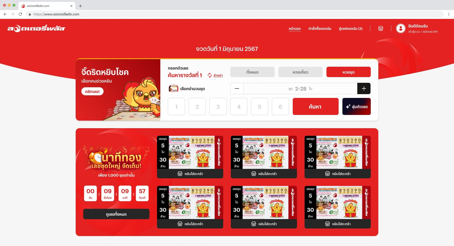
And on desktop: the search beside the mascot's lucky pick, the set count and the random button in the same cardและบนเดสก์ท็อป: ช่องค้นหาอยู่ข้างจิ๊ดริดหยิบโชค จำนวนชุดและปุ่มสุ่มตัวเลขอยู่ในการ์ดเดียวกัน
Part 2ตอนที่ 2
Finding a setค้นหาหวยชุด
The number in your head, as a set, in one search.เลขในใจ เป็นหวยชุด ในการค้นหาครั้งเดียว
Contextบริบท
Buyers come with a number in mind and often want it as a set: several tickets of one number. Most are 40 and up, not at home with technology, and often ask family to buy for them. The search box is where they stalled.คนซื้อมักมีเลขในใจ และอยากได้เป็นชุด คือหลายใบเลขเดียวกัน ส่วนใหญ่อายุ 40 ขึ้นไป ไม่ถนัดเทคโนโลยี และมักฝากลูกหลานซื้อให้ กล่องค้นหาคือจุดที่เขาติด
How it was worked outวิธีทำงาน
Hotjar, the last 30 daysข้อมูลจาก Hotjar ย้อนหลัง 30 วัน
By deviceแยกตามอุปกรณ์
- Phoneมือถือ546.2k
- Desktopเดสก์ท็อป5k
- Tabletแท็บเล็ต3.2k
98.5% came on a phone98.5% เข้ามาจากมือถือ
Share of all taps on the page, on phonesสัดส่วนจากการแตะทั้งหมดในหน้า บนมือถือ
- The search buttonปุ่มค้นหา18.44%426,679
- The first digit boxช่องเลขช่องแรก6.20%143,540
- The “set” tabแท็บ “หวยชุด”1.45%33,603
People type the number and search; the set tab is barely touched (on desktop, 0.50% of clicks)คนพิมพ์เลขแล้วกดค้นหาเลย แท็บหวยชุดแทบไม่มีคนแตะ (บนเดสก์ท็อป 0.50% ของการคลิก)
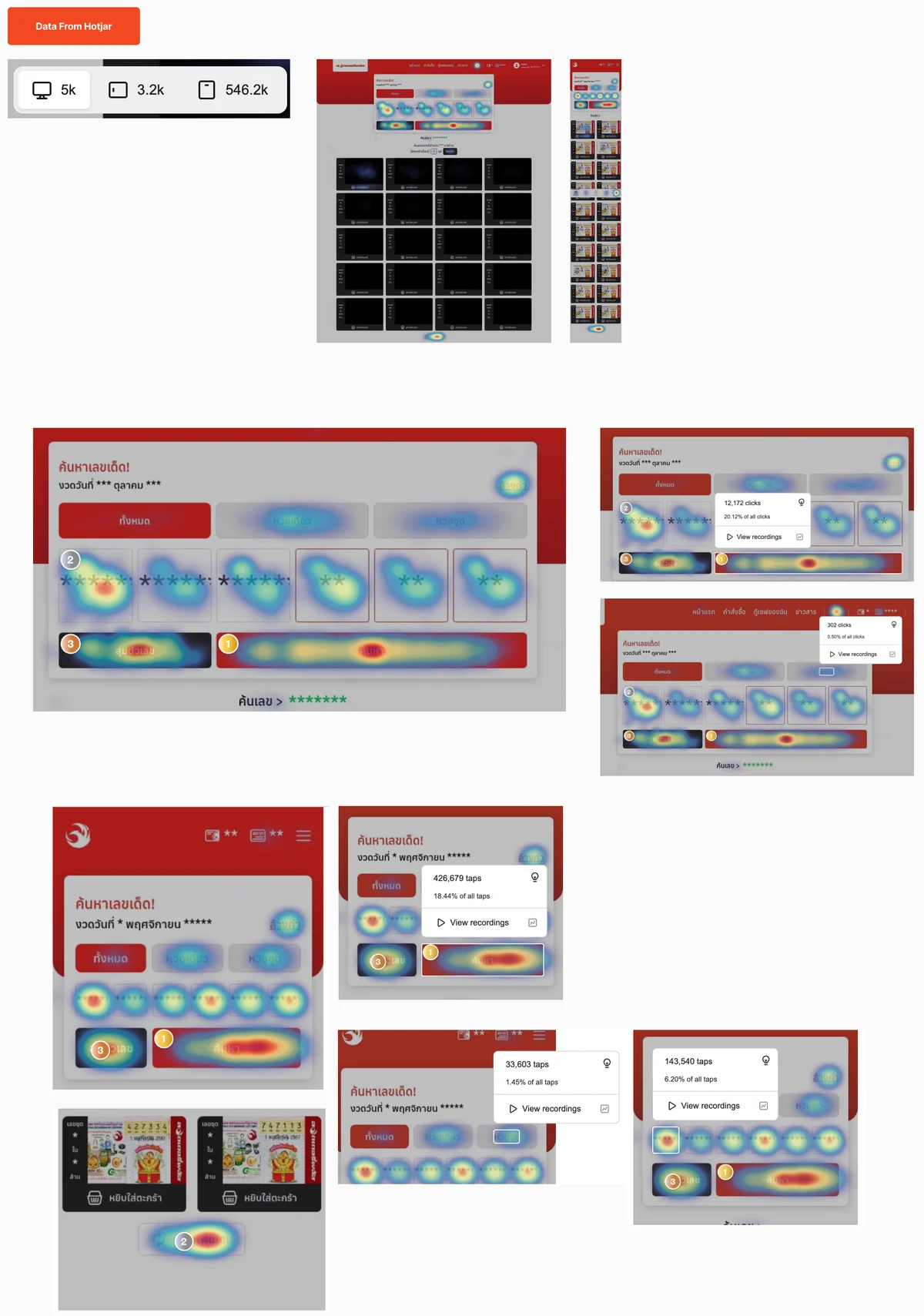
Data from Hotjar: where people tapped on the old search, on desktop and mobile. The search button most, then the number boxes and the random pickข้อมูลจาก Hotjar: จุดที่คนแตะบนหน้าค้นหาเดิม ทั้งเดสก์ท็อปและมือถือ ปุ่มค้นหาถูกแตะมากที่สุด ตามด้วยช่องกรอกเลขและปุ่มสุ่มตัวเลข Evidenceหลักฐาน
- Usability testing
- A/B testing
- Moderatedมีผู้ดำเนินการ
- Peopleผู้ทดสอบ5
- Agedอายุ35–45
- Women / menหญิง / ชาย4 / 1
How satisfied are you? Each design scored 1 to 7พึงพอใจแค่ไหน ให้คะแนนแต่ละแบบ 1 ถึง 7
- Strongly dissatisfiedไม่พอใจมาก
- Dissatisfiedไม่พอใจ
- Somewhat dissatisfiedค่อนข้างไม่พอใจ
- Neutralเฉยๆ
- Somewhat satisfiedค่อนข้างพอใจ
- Satisfiedพอใจ
- Very satisfiedพอใจมาก
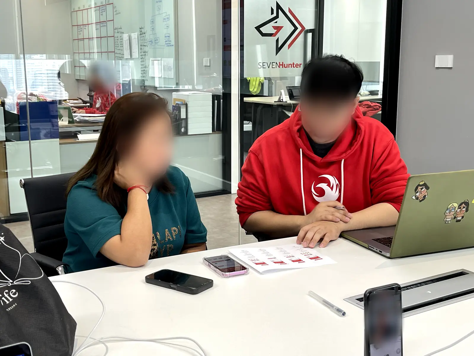
One to one: a moderator beside each person, a phone and the tasks on paperทดสอบตัวต่อตัว มีผู้ดำเนินการนั่งข้างๆ พร้อมมือถือ และโจทย์บนกระดาษ 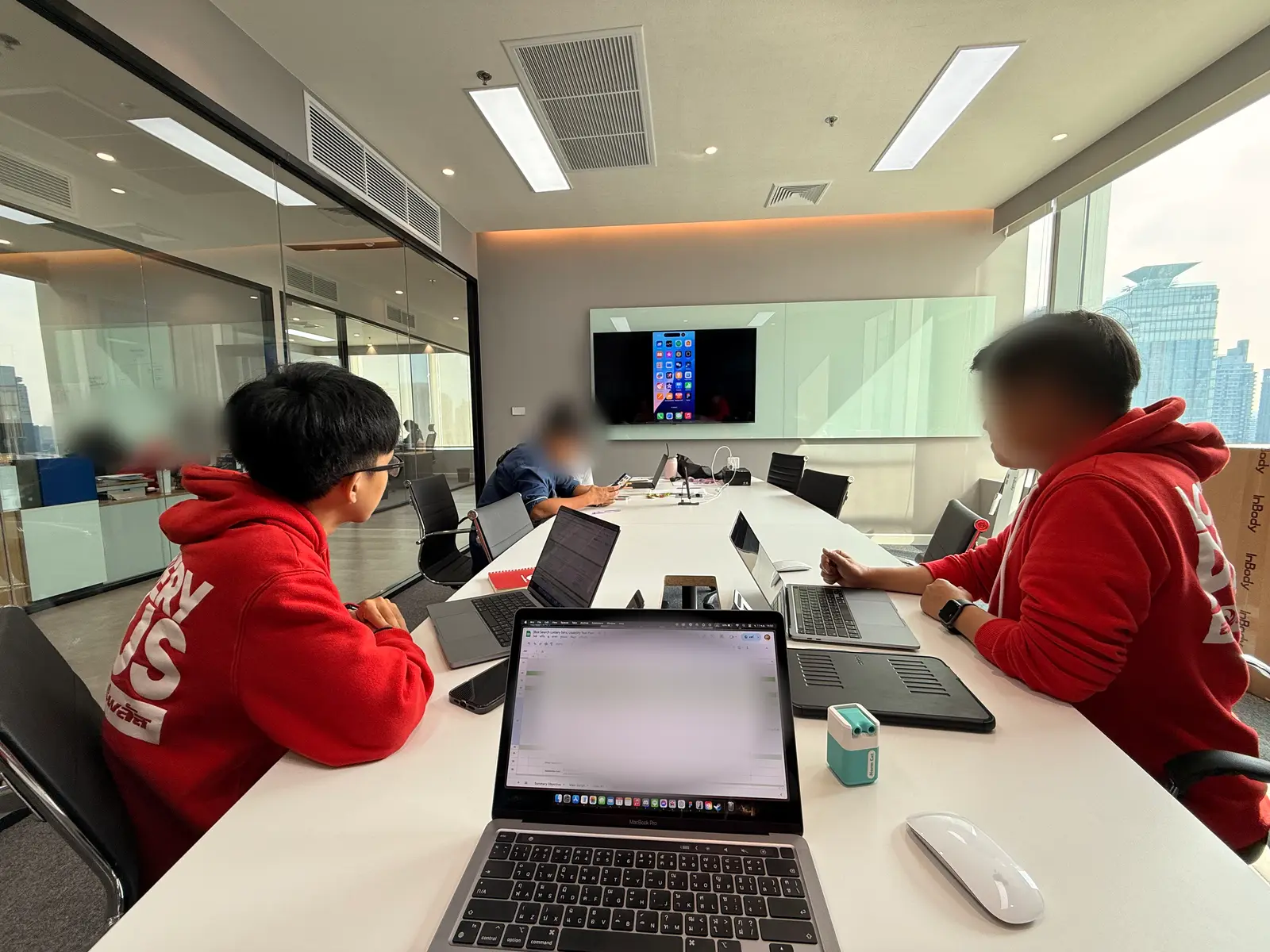
The rest of us watched the screen and took notes (me, on the left)ทีมที่เหลือดูหน้าจอ และจดบันทึก (ผมคนซ้าย) 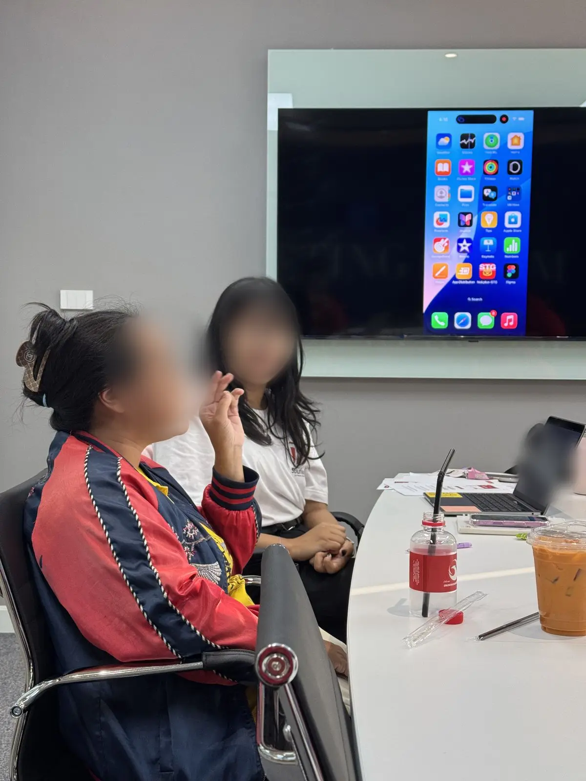
Talking it through with a participantคุยกับผู้ทดสอบระหว่างลองใช้ 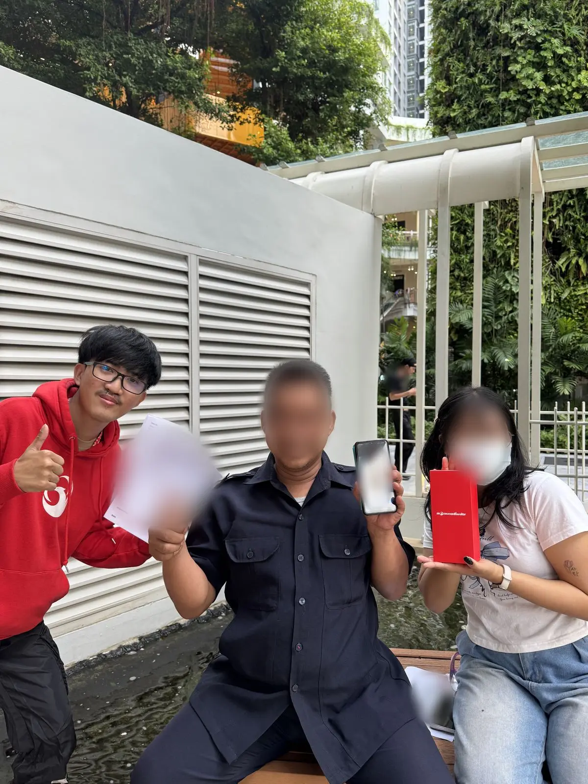
Testing in the field, with a real buyer (me, on the left)ลงพื้นที่ทดสอบกับผู้ใช้จริง (ผมคนซ้ายสุด) 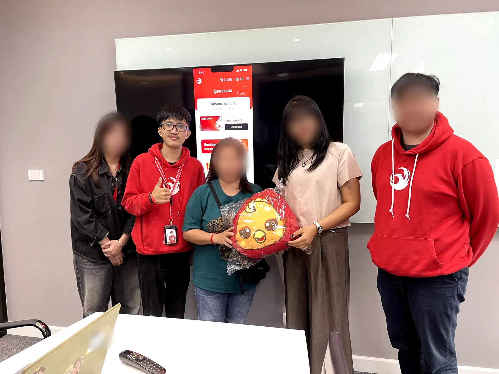
After the test (me, second from left)หลังทดสอบเสร็จ (ผมคนที่สองจากซ้าย) 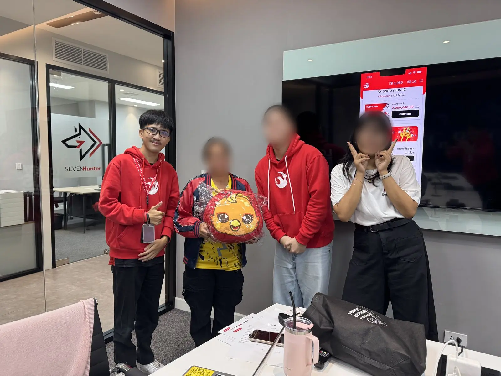
Another session, another thank-you (me, on the left)ขอบคุณผู้ทดสอบอีกรอบ (ผมคนซ้ายสุด)
- Hotjar · 30 daysHotjar · 30 วันPeople type the number and search first; the “set” tab is rarely touched. How many tickets comes after they like the number.คนพิมพ์เลขแล้วกดค้นหาเลย แทบไม่แตะแท็บ “หวยชุด” จำนวนใบค่อยเลือกทีหลังเมื่อถูกใจเลข
- Product ownerเจ้าของผลิตภัณฑ์The search box didn't stand out or invite use.กล่องค้นหาไม่สะดุดตา ไม่น่าใช้
- Usability test · 5 people aged 35–45 · moderated, in personทดสอบการใช้งาน · 5 คน อายุ 35–45 · มีผู้ดำเนินการ ตัวต่อตัวTask: buy a set of 6 tickets ending in 67.โจทย์: ซื้อหวยชุด 6 ใบ เลขท้าย 67
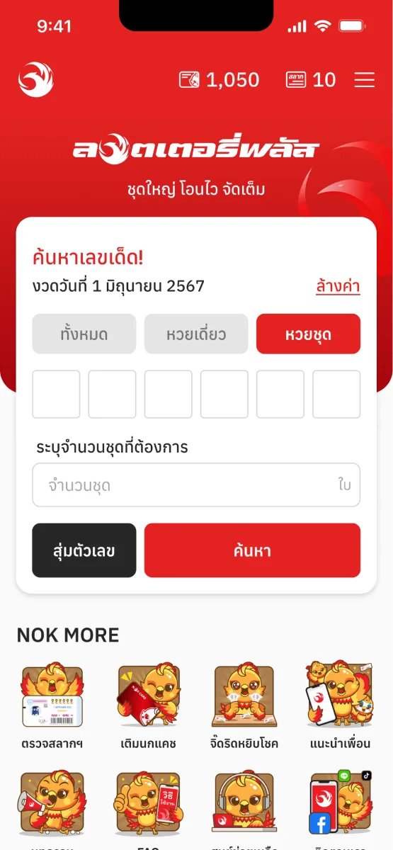
Before: the number and the count share one formก่อน: เลขกับจำนวนอยู่ในฟอร์มเดียวกัน - 1/5Likedชอบ: Liked typing the number: they know what they wantชอบพิมพ์เลข เพราะรู้ว่าตัวเองต้องการเลขอะไร
- 1/5Struggledติดปัญหา: Typed the number into the ticket-count boxกรอกเลขผิดช่อง ไปกรอกในช่องจำนวนใบ
- 2/5Struggledติดปัญหา: Never set how many ticketsไม่ได้กรอกจำนวนชุด
- 2/5Struggledติดปัญหา: Searched, then scrolled the results insteadกดค้นหาแล้วเลื่อนดูเอา แทนการระบุชุด
Satisfaction with the box as it was: 3.83 of 7.ความพึงพอใจกับกล่องแบบเดิม: 3.83 จาก 7
The problemโจทย์ที่ชัด
- As aในฐานะ
- lottery buyer aged 40 and up, not at home with technology, who often asks family to buy for themผู้ซื้อลอตเตอรี่อายุ 40 ขึ้นไป ที่ไม่ค่อยคุ้นกับเทคโนโลยี และมักฝากลูกหลานหรือคนอื่นซื้อให้
- I wantต้องการ
- to find a set of my number and say how many tickets without confusionค้นหาเลขที่ต้องการแบบชุด และระบุจำนวนชุดได้โดยไม่สับสน
- So thatเพื่อที่จะ
- I can buy it quickly without getting lost in the flowซื้อได้เร็ว ไม่หลงทางในโฟลว์
Decision & trade-offการตัดสินใจ และสิ่งที่แลก
Six ideas came out of a team brainstorm; three went to the same five people.ทีมระดมไอเดียได้ 6 แบบ คัดเหลือ 3 แบบไปให้ผู้ทดสอบ 5 คนเดิมลอง
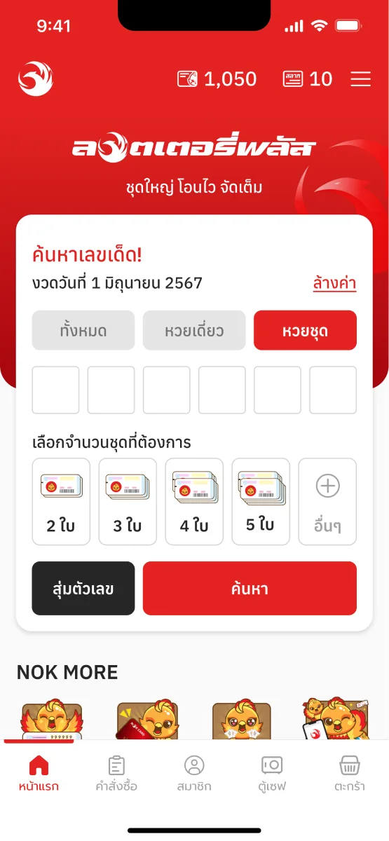
ASet chips + a picker for moreปุ่มจำนวนชุด + ตัวเลือกเพิ่ม
Satisfaction 6.76 / 7ความพึงพอใจ 6.76 / 7
Carried forwardได้ไปต่อ
- Likedชอบ: Tap, no typing (2/5)กดได้เลย ไม่ต้องพิมพ์ (2/5)
- Struggledติดปัญหา: Big sets take extra steps (2/5)ชุดใหญ่ต้องกดหลายขั้น (2/5)
- Struggledติดปัญหา: Scrolled the picker, never pressed Done (1/5)เลื่อนเลือกแล้วไม่กดเสร็จสิ้น (1/5)
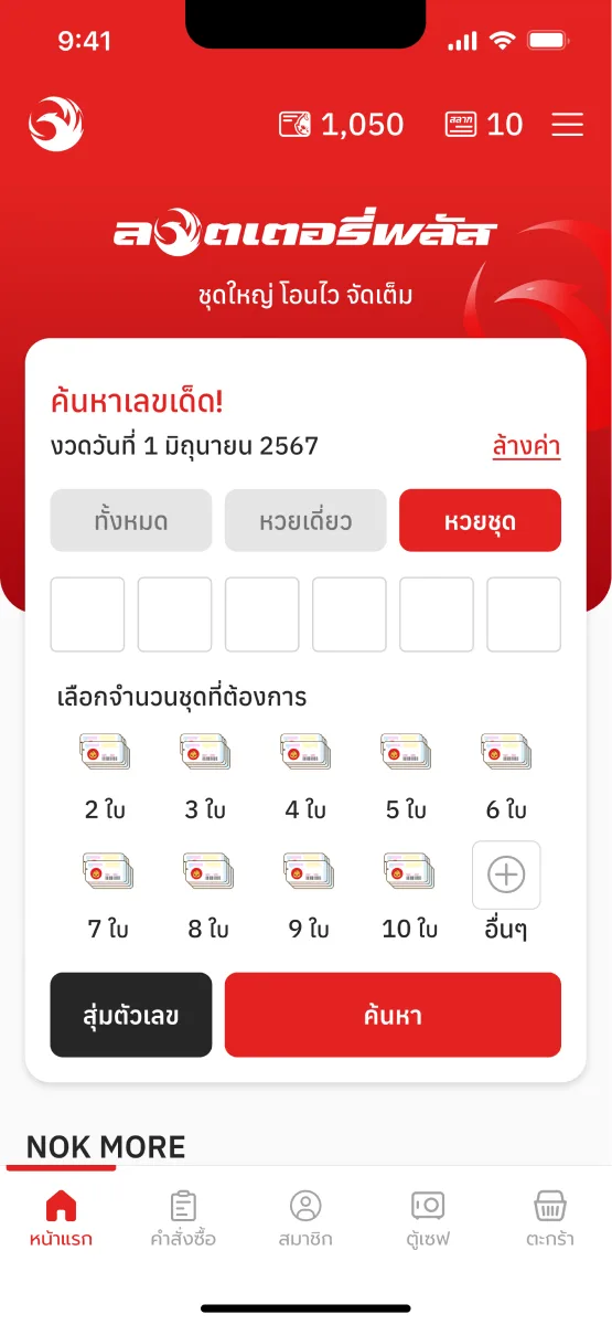
BA grid of 2–10ตารางจำนวน 2–10 ใบ
Satisfaction 6.76 / 7ความพึงพอใจ 6.76 / 7
Carried forwardได้ไปต่อ
- Likedชอบ: Tap, no typing (2/5)กดได้เลย ไม่ต้องพิมพ์ (2/5)
- Likedชอบ: More choices, easier (2/5)ตัวเลือกเยอะกว่า ง่ายกว่า (2/5)
- Struggledติดปัญหา: Too many icons: cluttered (2/5)ไอคอนเยอะไป ดูรก (2/5)
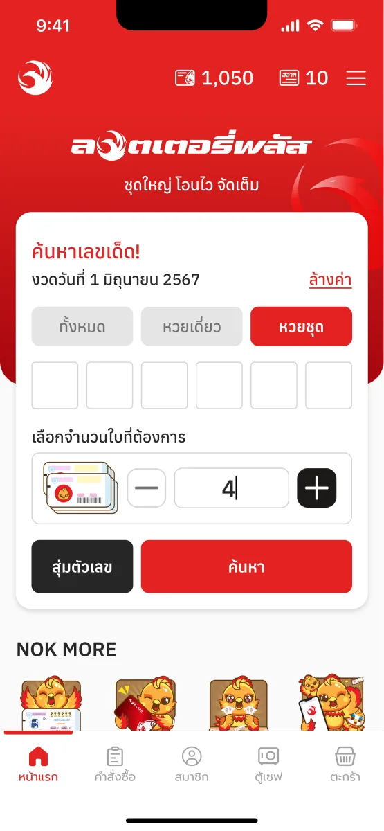
CA − / + stepperปุ่มบวก–ลบ
Satisfaction 5.46 / 7ความพึงพอใจ 5.46 / 7
- Likedชอบ: Type or tap (2/5)พิมพ์ก็ได้ กดก็ได้ (2/5)
- Struggledติดปัญหา: Must decide the count yourself (2/5)ต้องคิดจำนวนเอง (2/5)
- Struggledติดปัญหา: Sets or tickets? unclear (1/5)ไม่แน่ใจว่าเลือกจำนวนชุดหรือจำนวนใบ (1/5)
- Struggledติดปัญหา: Afraid “−” would switch the tab (2/5)กังวลว่ากดลบแล้วแท็บจะเปลี่ยน (2/5)
A and B tied and went on together; the stepper scored lowest. A field visit showed the real struggle was small screens and hard scrolling. In the merged round the count became a limited choice, 2 to 28, since one draw holds at most 28 tickets of a number, and below 2 it would be a single. What shipped: type the count, or step it with − and +.A กับ B คะแนนเท่ากันจึงไปต่อด้วยกัน ส่วนปุ่มบวก–ลบได้ต่ำสุด การลงพื้นที่พบว่าปัญหาจริงคือจอเล็กและการเลื่อนที่ยาก ในรอบที่รวมงาน จำนวนชุดกลายเป็นการเลือกแบบมีลิมิต 2 ถึง 28 ใบ เพราะหนึ่งงวดมีเลขชุดได้มากสุด 28 ใบ และต่ำกว่า 2 ก็คือหวยเดี่ยว แบบที่ขึ้นจริง: พิมพ์จำนวนเอง หรือกด − และ +
Validationการพิสูจน์
- Task successทำสำเร็จ100%
- Satisfaction, of 7ความพึงพอใจ จาก 7Beforeก่อน 3.83Afterหลัง 6.76+76.5%
- “Easy, clear, not many steps. I can do it.”“ง่ายดี เห็นชัด ไม่หลายสเต็ป พี่ทำได้”
- “The sets line up right there. I see it, no thinking.”“พี่ชอบมันเห็นใบชุดที่ต้องการเรียงกันเลย พี่เห็นภาพเลย ไม่ต้องคิด”
Same five people, prototype scores. It ranks the ideas; it isn't a launch number.ผู้ทดสอบชุดเดิม 5 คน คะแนนจากต้นแบบ ใช้จัดอันดับไอเดีย ยังไม่ใช่ตัวเลขหลังเปิดใช้จริง
Resultผลลัพธ์
What shipped is a new home page with the search box leading it: the three ticket types up front, numbered digit boxes, and for a set, a count you type or step with − and +, starting at 2; search is the main button.สิ่งที่ขึ้นจริงคือหน้าแรกแบบใหม่ ที่ให้กล่องค้นหานำหน้า: ประเภทหวยสามแบบอยู่ด้านบน ช่องเลขมีตัวเลขกำกับ และถ้าเป็นหวยชุด มีช่องจำนวนที่พิมพ์เองหรือกด − และ + ได้ เริ่มที่ 2 ใบ ปุ่มค้นหาเป็นปุ่มหลัก
The final home page: a set, by number and countหน้าแรกเวอร์ชัน final: หวยชุด ค้นจากเลขและจำนวน - Ticket types up frontประเภทหวยอยู่ด้านบน
- Numbered digit boxesช่องเลขมีตัวเลขกำกับ
- The count: type it, or − / +, from 2จำนวน: พิมพ์เอง หรือกด − / + เริ่มที่ 2
- Search is the main buttonปุ่มค้นหาเป็นปุ่มหลัก
What I took from itสิ่งที่ได้เรียนรู้A vague brief is a question to answer before it's a thing to build: “not proud” turned out to mean hard to use, and only watching people buy a set showed where.คำสั่งที่ไม่ชัด คือคำถามที่ต้องหาคำตอบก่อนลงมือทำ: “ไม่พราว” กลายเป็นว่าใช้ยาก และต้องดูคนซื้อหวยชุดจริงถึงจะเห็นว่าติดตรงไหน
Part 3ตอนที่ 3
Getting through sign-upสมัครสมาชิกให้ผ่าน
A sign-up people can finish, and 15% more of them did.การสมัครที่ทำจนจบได้ และคนสมัครสำเร็จเพิ่มขึ้น 15%
Contextบริบท
Feedback and Hotjar agreed: people left sign-up unfinished. Failures had climbed to 20%, from a usual 10–15%, and 105 of 1,884 people surveyed named sign-up as where they got stuck: too many fields, nothing marked skippable, details they couldn't recall.ทั้ง feedback และ Hotjar บอกตรงกันว่าคนออกจากหน้าสมัครโดยไม่สำเร็จ การสมัครไม่สำเร็จขึ้นไปถึง 20% จากปกติ 10–15% และในแบบสำรวจ 1,884 คน มี 105 คนบอกว่าติดตอนสมัคร: ช่องกรอกเยอะ ไม่รู้ว่าข้ามได้ และจำข้อมูลบางอย่างไม่ได้
- 20%of sign-ups failedสมัครไม่สำเร็จusual: 10–15%ปกติ 10–15%
- 105 of 1,884จาก 1,884people in a survey said sign-up was where they got stuckคนในแบบสำรวจ บอกว่าติดตอนสมัคร
Evidenceหลักฐาน
- Field study · 4 peopleลงพื้นที่ · 4 คนWatched each person sign up, then asked why.ดูแต่ละคนสมัครจริง แล้วถามว่าทำไม
- Maze prototype test · 14 peopleทดสอบต้นแบบบน Maze · 14 คน13 of 14 finished; 3 stalled at the bank account.กรอกครบ 13 จาก 14 คน ติดที่เลขบัญชี 3 คน
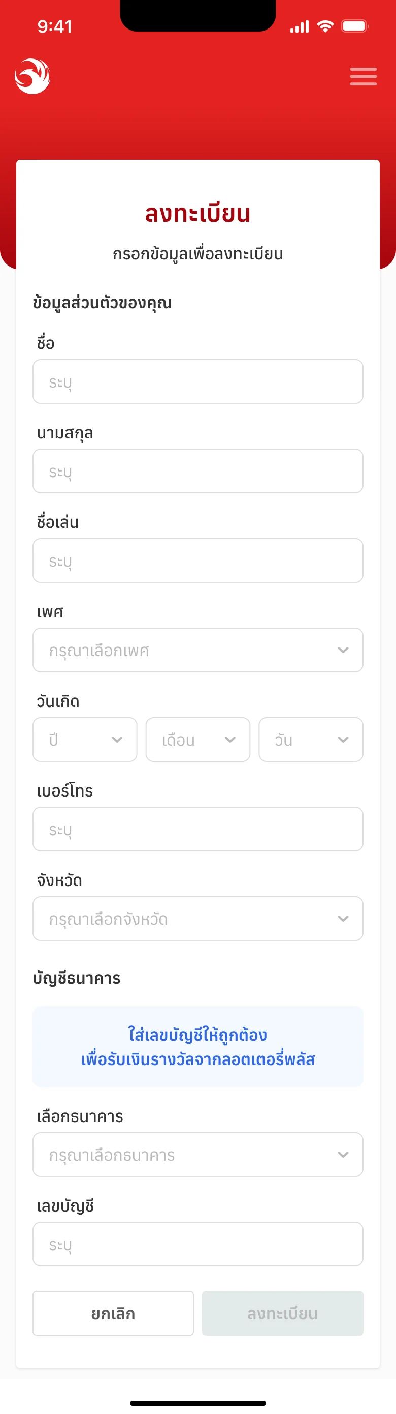
Before: one long page, every field at onceก่อน: หน้าเดียวยาว ทุกช่องในครั้งเดียว - 4/4Struggledติดปัญหา: Ignored the red asterisk: filled in every fieldไม่สนใจดอกจันสีแดง กรอกทุกช่อง
- 4/4Struggledติดปัญหา: Birthday picker: tiny scroll area, and picking out of order reset itช่องวันเกิดเลือกยาก พื้นที่เลื่อนเล็ก เลือกไม่ตามลำดับแล้วรีเซ็ต
- 3/4Struggledติดปัญหา: Couldn't remember the bank account, left for the banking appจำเลขบัญชีไม่ได้ ต้องออกไปเปิดแอปธนาคาร
- 3/4Struggledติดปัญหา: “Province”: the one on my ID card, or where I live now?“จังหวัด” คือจังหวัดตามบัตรประชาชน หรือจังหวัดที่อาศัยอยู่ตอนนี้
The problemโจทย์ที่ชัด
- As aในฐานะ
- new user signing up to buy lotteryผู้ใช้ใหม่ที่สมัครเพื่อซื้อหวย
- I wantต้องการ
- a sign-up that's short and plainการสมัครที่ง่าย ไม่ซับซ้อน
- So thatเพื่อที่จะ
- I finish it and buy without getting stuckสมัครสำเร็จ และซื้อได้โดยไม่ติดขัด
How it was worked outวิธีทำงาน
How the sign-up was worked out, in order: hypotheses checked in the field, ideas for the three problems, the best two of each made into prototypes, then an A/B test.ลำดับการทำงานของหน้าสมัคร: ตั้งสมมติฐานแล้วตรวจกับผู้ใช้จริง ระดมไอเดียสามเรื่อง ทำต้นแบบเรื่องละสองแบบ แล้ว A/B test
Hypotheses, checked with real usersตั้งสมมติฐาน แล้วตรวจกับผู้ใช้จริง
- Field study · 4 people · 3 of 4 signed upลงพื้นที่ · 4 คน · สมัครสำเร็จ 3 จาก 4
- Maze prototype · 14 people · 14 of 14 signed upต้นแบบใน Maze · 14 คน · สมัครสำเร็จ 14 จาก 14
- Hypothesisสมมติฐาน
People can't remember their account number, and leave for the banking appผู้ใช้จำเลขบัญชีตัวเองไม่ได้ ต้องออกไปดูที่แอปธนาคาร
What we foundสิ่งที่พบHeldเจอจริงAll 4 filled it in, but 3 of 4 had to leave for the banking app, and 2 of 4 had to start again. In Maze, 3 of 14 stuck on it.กรอกครบทั้ง 4 คน แต่ 3 จาก 4 ต้องออกไปดูแอปธนาคาร และ 2 จาก 4 ต้องเริ่มกรอกใหม่ ใน Maze ติดตรงนี้ 3 จาก 14
- Hypothesisสมมติฐาน
Nobody knows a red asterisk means required, so they fill in everythingผู้ใช้ไม่รู้ว่าดอกจันสีแดงคือช่องที่จำเป็น จึงกรอกทุกช่อง
What we foundสิ่งที่พบHeldเจอจริง4 of 4 filled every field: nobody noticed the asterisk, or knew what it meant.กรอกครบทุกช่อง 4 จาก 4 เพราะไม่สังเกต หรือไม่รู้ว่าดอกจันคืออะไร
- Hypothesisสมมติฐาน
Three birthday boxes, each scrolled to the right value, take too longวันเกิดสามช่อง ต้องเลื่อนหาทีละช่อง ทำให้เสียเวลา
What we foundสิ่งที่พบHeldเจอจริง4 of 4 tried to type it; 2 of 4 found the small scroll area hard; 2 of 4 picked out of order, and it reset.พยายามพิมพ์ 4 จาก 4 เลื่อนยากเพราะพื้นที่เล็ก 2 จาก 4 และเลือกไม่ตามลำดับจนข้อมูลรีเซ็ต 2 จาก 4
- Hypothesisสมมติฐาน
Cancel, tapped by mistake, sends people back to the startเผลอกดยกเลิก แล้วต้องเริ่มใหม่
What we foundสิ่งที่พบHeldเจอจริง1 of 4 tapped Cancel to close a dropdown; 2 of 4 had to start the form again.กดยกเลิกเพื่อปิดดรอปดาวน์ 1 จาก 4 และต้องเริ่มกรอกใหม่ทั้งหมด 2 จาก 4
- Hypothesisสมมติฐาน
No digit grouping, no character count and no “that's right” cue cause the errorsไม่มีการจัดกลุ่มตัวเลข ตัวนับอักษร หรือการบอกว่ากรอกถูกแล้ว ทำให้กรอกผิด
What we foundสิ่งที่พบNot the causeไม่ใช่สาเหตุNobody got stuck there. The errors came from the account number people couldn't remember.ไม่มีใครติดตรงนี้ ที่กรอกผิดเพราะจำเลขบัญชีไม่ได้
Ideas, for the three problemsระดมไอเดีย สามเรื่อง
The formหน้าฟอร์ม
The birthdayวันเกิด
The bank accountเลขบัญชี
And in every optionและแก้ในทุกตัวเลือก
- “Province where you live”“จังหวัดที่อาศัยอยู่”
- (required) and (optional) in words, not *(จำเป็น) และ (ไม่จำเป็น) เป็นคำ แทน *
- Referral code (optional), not “(if any)”รหัสผู้แนะนำ (ไม่จำเป็น) แทน “(ถ้ามี)”
- Darker hint text in the boxesคำไกด์ในช่องเข้มขึ้น
- A dark overlay behind dropdowns, so Cancel isn't tapped by mistakeพื้นหลังเข้มหลังดรอปดาวน์ ไม่ให้เผลอกดยกเลิก
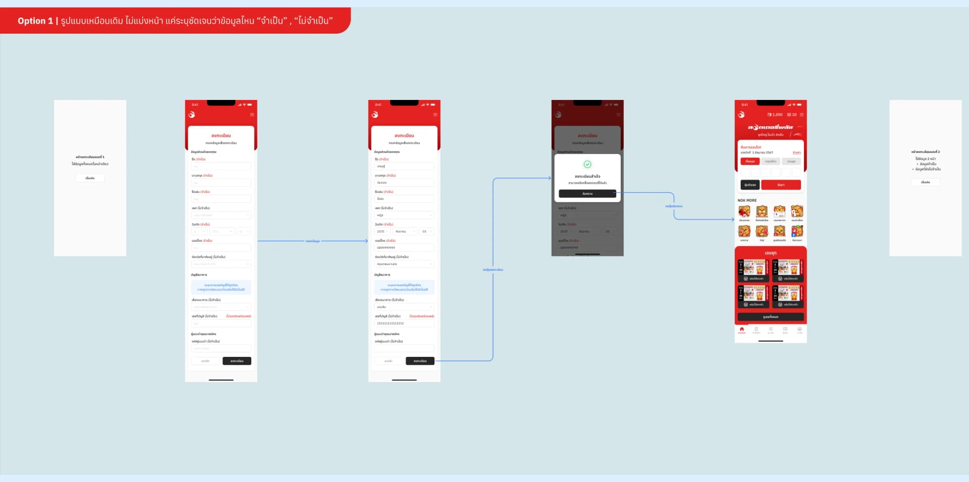
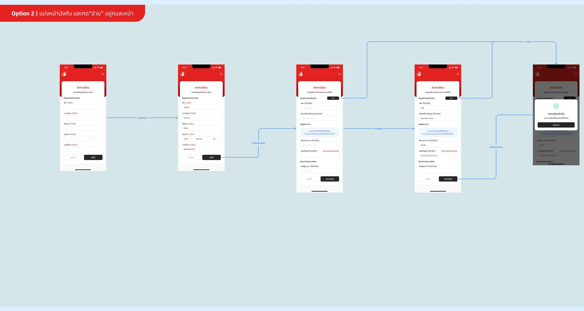
Prototypes, the best two of eachทำต้นแบบ เรื่องละสองแบบ
Six clickable prototypes in Figma, every screen of each flow.ต้นแบบที่กดได้จริง 6 แบบใน Figma ครบทุกหน้าของแต่ละโฟลว์
An A/B test, then the callA/B test แล้วตัดสินใจ
- A/B test in Maze · 22 peopleA/B test ใน Maze · 22 คน
Finding people who had never signed up: I posted the asks myself.หาคนที่ไม่เคยสมัครมาก่อนมาทดสอบ ผมโพสต์ชวนเอง

On Discord: 3 to 5 minutes, for anyone who has never signed upโพสต์ใน Discord ใช้เวลา 3–5 นาที สำหรับคนที่ไม่เคยสมัคร 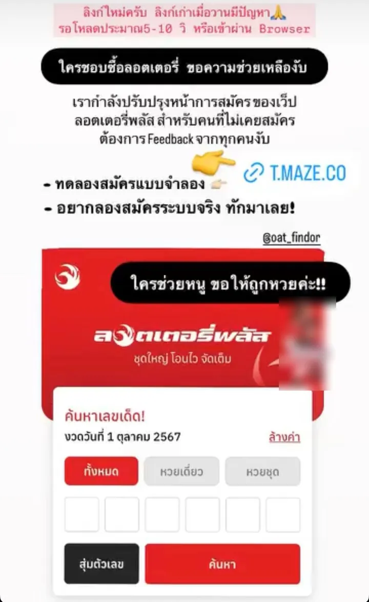
An Instagram story, for anyone who likes buying lottery ticketsInstagram story ชวนคนที่ชอบซื้อลอตเตอรี่
Which is easier to fill in?การกรอกข้อมูลแบบไหนง่ายกว่ากัน
22 answeredตอบ 22 คน
One page won the vote, but the field study showed the trouble was small screens and long scrolls, so two pages went forward.หน้าเดียวชนะโหวต แต่การลงพื้นที่พบว่าปัญหาคือจอเล็กและเลื่อนยาก แบบสองหน้าจึงได้ไปต่อ
Which birthday entry is easier?การกรอกวันเกิดแบบไหนง่ายกว่ากัน
19 answeredตอบ 19 คน
Scrolling went forward, in day, month, year order, with bigger, darker text.แบบเลื่อนได้ไปต่อ โดยเรียงเป็น วัน เดือน ปี และตัวหนังสือใหญ่ เข้มขึ้น
Which feels better for the account number?การให้เลขบัญชีแบบไหนรู้สึกโอเคกว่ากัน
18 answeredตอบ 18 คน
What shipped: the account on the page you can skip, with a reminder to add it.ที่ขึ้นจริง: เลขบัญชีอยู่ในหน้าที่ข้ามได้ พร้อมแจ้งเตือนให้กลับมาใส่
Decision & trade-offการตัดสินใจ และสิ่งที่แลก
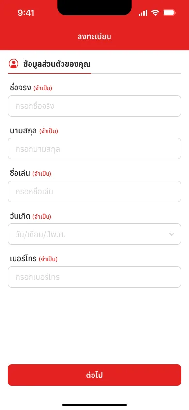
Page 1: only what's requiredหน้า 1: เฉพาะที่จำเป็น 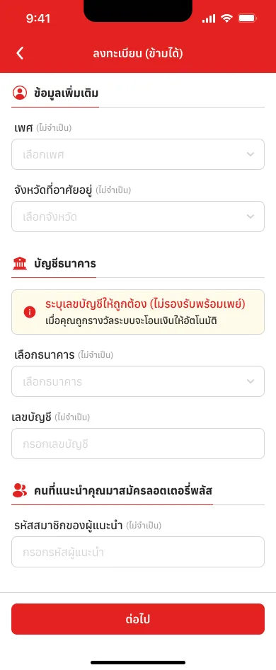
Page 2: skippable, every field optionalหน้า 2: ข้ามได้ ทุกช่องไม่บังคับ
Two pages: what's required, then a page you can skip. Every field says (required) or (optional) in wordsแยกเป็นสองหน้า: ช่องที่จำเป็น แล้วตามด้วยหน้าที่ข้ามได้ ทุกช่องเขียนกำกับว่า (จำเป็น) หรือ (ไม่จำเป็น)
Whyเพราะ Nobody read the asterisk; a page that says “skip” needs no readingไม่มีใครอ่านดอกจัน หน้าที่บอกว่า “ข้ามได้” ไม่ต้องอ่านก็เข้าใจ
Instead ofแทนที่จะ One page, only relabelledคงหน้าเดียว แค่เปลี่ยนป้ายกำกับ
The bank account moves to the page you can skip, with the reason: winnings are paid there automaticallyย้ายบัญชีธนาคารไปหน้าที่ข้ามได้ พร้อมบอกเหตุผลว่าถูกรางวัลแล้วระบบโอนให้อัตโนมัติ
Whyเพราะ The commonest stall was leaving to look the number up in another appจุดที่ติดบ่อยที่สุดคือการออกไปหาเลขบัญชีในแอปอื่น
Instead ofแทนที่จะ Drop it, and ask only when someone winsตัดออกไปเลย แล้วค่อยถามตอนถูกรางวัล
“Province where you live”, said in wordsเปลี่ยนเป็น “จังหวัดที่อาศัยอยู่”
Whyเพราะ In the test people asked which province: the one on their ID card, or where they live now. The label answers it, without asking for location accessตอนทดสอบ คนงงว่าคือจังหวัดไหน ตามบัตรประชาชน หรือที่อาศัยอยู่ตอนนี้ ป้ายจึงบอกให้ชัด โดยไม่ต้องขอสิทธิ์เข้าถึงตำแหน่ง
Instead ofแทนที่จะ Fill it from the phone's locationดึงจากตำแหน่งของโทรศัพท์
In the survey, one page edged out two, 55% to 45% (12 and 10 of 22). The field study tipped it: the people who struggled were on small screens with long scrolls, and two pages solved more for them.ในแบบสำรวจ หน้าเดียวชนะสองหน้าเล็กน้อย 55% ต่อ 45% (12 และ 10 จาก 22 คน) แต่การลงพื้นที่พบว่าคนที่มีปัญหาคือคนที่ใช้จอเล็กและเลื่อนยาก แบบสองหน้าจึงแก้ปัญหาให้เขาได้มากกว่า
Validationการพิสูจน์
- People who finished sign-up, once the new one was liveคนสมัครสำเร็จ หลังการสมัครแบบใหม่ขึ้นจริง+15%
- Chose the slide-up birthday picker, in the solution testเลือกตัวเลือกวันเกิดแบบเลื่อน ในการทดสอบ Solution84%
Part 4ตอนที่ 4
Checking your ticketตรวจสลาก
Type the number first; the rest is already set.พิมพ์เลขได้ทันที ที่เหลือตั้งไว้ให้แล้ว
Contextบริบท
After a draw, checking a ticket is why many people open LotteryPlus. I designed both versions. The old one asked for the draw first, then three number boxes; by Hick's Law, every choice up front slows the decision.หลังออกรางวัล การตรวจสลากคือเหตุผลที่หลายคนเปิดลอตเตอรี่พลัส ผมออกแบบทั้งสองเวอร์ชัน แบบเดิมให้เลือกงวดก่อน แล้วมีช่องกรอกเลข 3 ช่อง ตาม Hick's Law ทุกตัวเลือกที่อยู่ข้างหน้าทำให้ตัดสินใจช้าลง
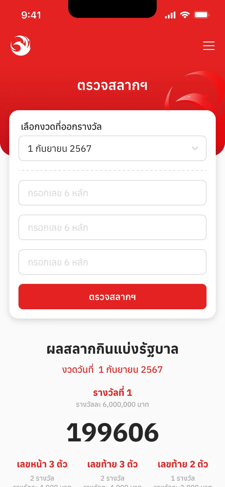
Before: the draw first, then three boxesก่อน: เลือกงวดก่อน แล้วกรอกเลข 3 ช่อง Decision & trade-offการตัดสินใจ และสิ่งที่แลก
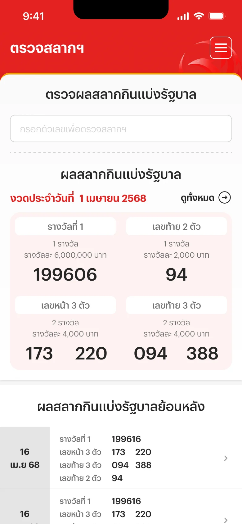
Final: one box, the latest results right belowfinal: ช่องเดียว ผลรางวัลงวดล่าสุดอยู่ด้านล่าง 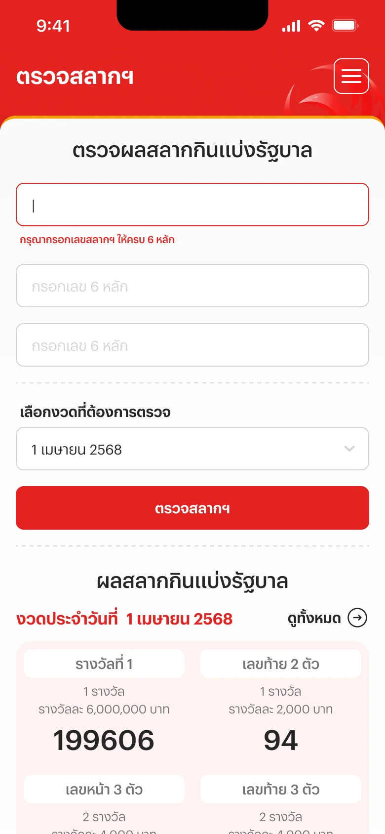
Tap it: two more boxes and the draw open, set to the current drawแตะแล้ว: อีก 2 ช่องและงวดกางออกมา ตั้งเป็นงวดปัจจุบันไว้แล้ว
The number comes first: tap the box and typeให้เลขมาก่อน แตะช่องแล้วพิมพ์ได้ทันที
Whyเพราะ Fewer choices up front, a quicker start (Hick's Law)ตัวเลือกข้างหน้าน้อยลง เริ่มได้เร็วขึ้น (Hick's Law)
Instead ofแทนที่จะ Pick the draw first, then the numberเลือกงวดก่อน แล้วค่อยกรอกเลข
Two more boxes and the draw open out after, set to the current drawอีก 2 ช่องและการเลือกงวดกางออกมาทีหลัง โดยตั้งเป็นงวดปัจจุบันไว้แล้ว
Whyเพราะ Most people check the latest draw, so it needn't be a choiceคนส่วนใหญ่ตรวจงวดล่าสุด จึงไม่จำเป็นต้องให้เลือก
Instead ofแทนที่จะ Everyone picks a draw before anything elseให้ทุกคนเลือกงวดก่อนทำอย่างอื่น
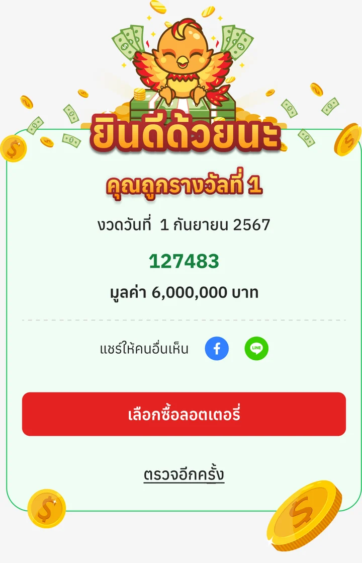
Check it yourself, then share what you wonตรวจรางวัลได้เอง แล้วแชร์ลงโซเชียลได้ว่าถูกรางวัลอะไร
Whyเพราะ A win people want to show off brings them back to check, and helps more people find LotteryPlus on Googleรางวัลที่อยากอวด ทำให้คนอยากกลับมาตรวจ และช่วยให้คนเจอลอตเตอรี่พลัสจาก Google มากขึ้น
Instead ofแทนที่จะ A result only you can seeผลรางวัลที่เห็นได้คนเดียว
Resultผลลัพธ์
More people now check their tickets on LotteryPlus, and more of them come from Google. There are no numbers to quote yet.ตอนนี้คนใช้ตรวจสลากบนลอตเตอรี่พลัสมากขึ้น และคนเข้าจาก Google มากขึ้น ยังไม่มีตัวเลขที่บอกได้
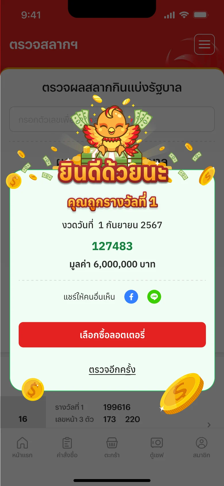
A win: the prize, its value, and share buttons right thereถูกรางวัล: บอกรางวัลและมูลค่า พร้อมปุ่มแชร์ทันที 
The card it shares: “the next millionaire could be you”, a link back to checkการ์ดที่แชร์ไป: “เศรษฐีคนใหม่อาจเป็นคุณ” พร้อมลิงก์กลับมาตรวจ
Part 5ตอนที่ 5
Adding a bank account, laterบัญชีธนาคาร กรอกทีหลังได้
Add it yourself; to change it, talk to a person.กรอกเองได้ ถ้าจะแก้ คุยกับเจ้าหน้าที่
Contextบริบท
The new sign-up lets people skip the bank account, so adding it later has to be easy: prizes are paid into it automatically, and a reminder comes before each draw. Before, even a change meant the help center's long form and a photo of the bank book.การสมัครแบบใหม่ให้ข้ามบัญชีธนาคารได้ การกรอกทีหลังจึงต้องง่าย เพราะเงินรางวัลโอนเข้าบัญชีนี้อัตโนมัติ และมีการเตือนก่อนวันออกรางวัล แต่เดิมแค่จะแก้บัญชี ก็ต้องกรอกฟอร์มยาวในศูนย์ช่วยเหลือ และแนบรูปหน้าสมุดบัญชี
Decision & trade-offการตัดสินใจ และสิ่งที่แลก
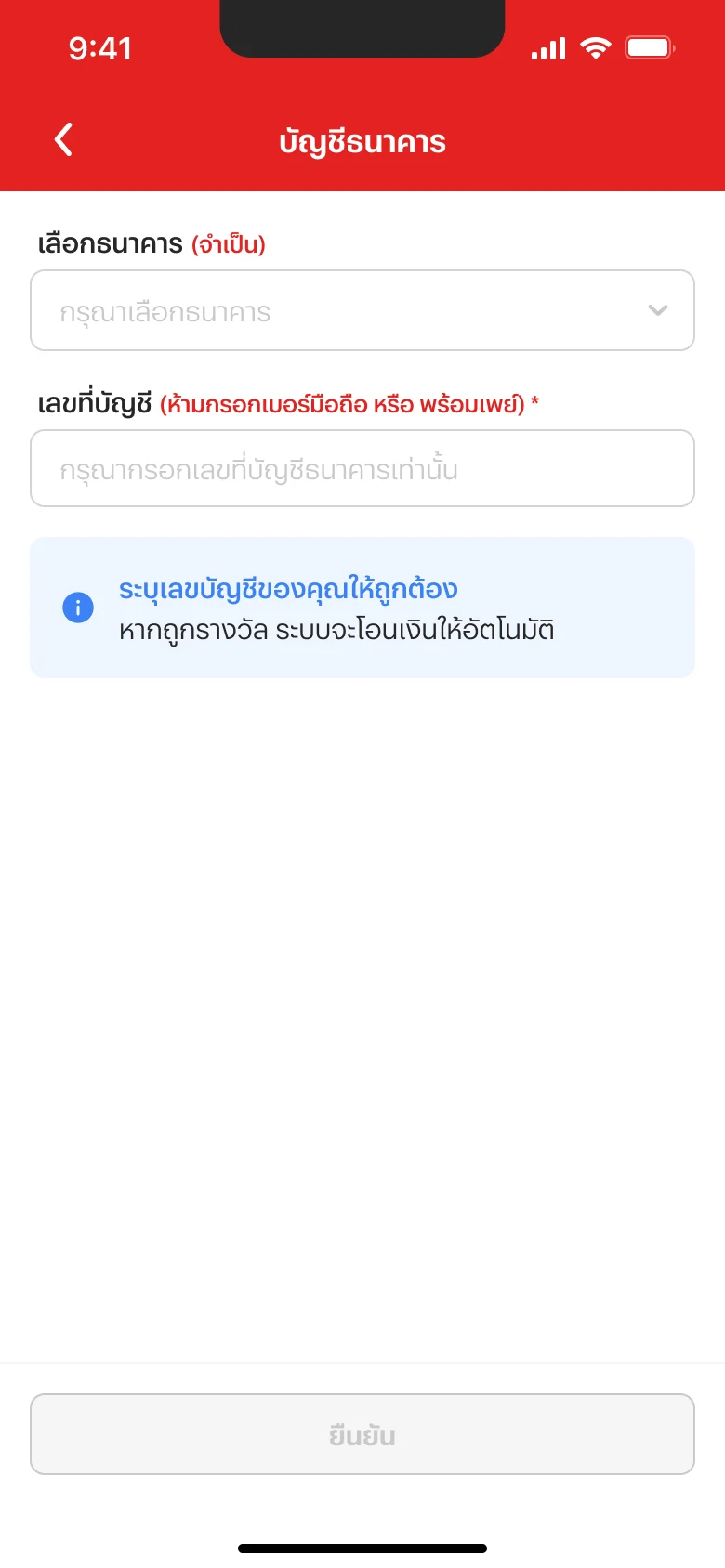
Add it yourselfกรอกเองได้ 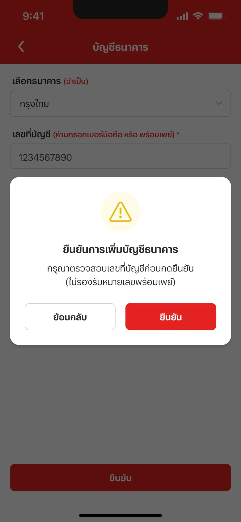
Check the number before it savesตรวจเลขบัญชีก่อนบันทึก 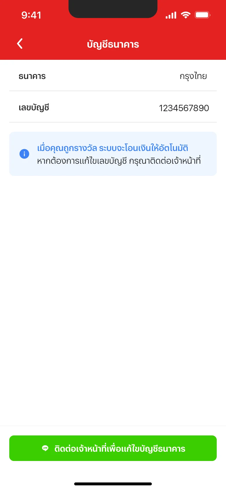
Already added: change it with staff on LINEเคยกรอกแล้ว แก้ไขผ่านเจ้าหน้าที่ทาง LINE
First time: add it yourself, with a note that prizes are paid into it automaticallyครั้งแรกกรอกเองได้ พร้อมบอกว่าถูกรางวัลแล้วระบบโอนเงินให้อัตโนมัติ
Whyเพราะ It's the step sign-up let people skip, so it has to be easy to come back toเป็นขั้นที่การสมัครให้ข้ามได้ จึงต้องกลับมากรอกได้ง่าย
Instead ofแทนที่จะ Ask for it again during sign-upบังคับกรอกตอนสมัครเหมือนเดิม
A check before saving: confirm the number, and no phone numbers or PromptPayมีขั้นยืนยันก่อนบันทึก ให้ตรวจเลขบัญชี และไม่รับเบอร์โทรหรือพร้อมเพย์
Whyเพราะ A wrong number sends a prize to the wrong place; CRM asked for the check, worded as confirming the accountเลขผิด เงินรางวัลก็โอนผิดที่ CRM จึงขอให้มีขั้นยืนยัน และใช้คำว่ายืนยันบัญชีธนาคาร
Instead ofแทนที่จะ Save as soon as it's typedบันทึกทันทีที่กรอกเสร็จ
Already added? Changing it is one button to staff on LINEเคยกรอกแล้ว ถ้าจะแก้ กดปุ่มเดียวไปคุยกับเจ้าหน้าที่ทาง LINE
Whyเพราะ The same channel the help center now uses, where the team already worksใช้ช่องทางเดียวกับศูนย์ช่วยเหลือแบบใหม่ ที่ทีมใช้ทำงานอยู่แล้ว
Instead ofแทนที่จะ The help center's long form and a photo of the bank bookฟอร์มยาวในศูนย์ช่วยเหลือ และแนบรูปหน้าสมุดบัญชี
Resultผลลัพธ์
Adding an account is a short form with a check before it saves; changing one is a conversation with a person, in the channel the team already runs.การเพิ่มบัญชีเป็นฟอร์มสั้นที่มีขั้นยืนยันก่อนบันทึก ส่วนการแก้ไขเป็นการคุยกับเจ้าหน้าที่ ในช่องทางที่ทีมใช้อยู่แล้ว
Part 6ตอนที่ 6
The help centerศูนย์ช่วยเหลือ
Fewer choices, one channel, less double work.ตัวเลือกน้อยลง ช่องทางเดียว งานซ้ำน้อยลง
Contextบริบท
The old help center asked for a category, a topic and a form sent to a separate back office, while CRM works in LINE. Cases arrived twice, history was lost, and categories were often wrong. The aim: fewer steps, and an easier job for CRM.ศูนย์ช่วยเหลือแบบเดิมให้เลือกหมวดหมู่ หัวข้อ และกรอกฟอร์มที่ส่งไประบบหลังบ้านอีกระบบ ทั้งที่ CRM ทำงานใน LINE เรื่องจึงเข้ามาซ้ำสองทาง ประวัติหาย และหมวดหมู่มักไม่ตรง เป้าหมายคือลดขั้นตอน และให้ CRM ทำงานง่ายขึ้น
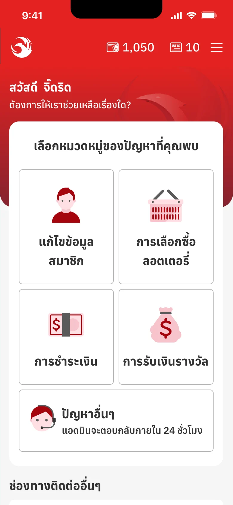
Before: pick a category, then a topic, then a formก่อน: เลือกหมวดหมู่ เลือกหัวข้อ แล้วกรอกฟอร์ม Decision & trade-offการตัดสินใจ และสิ่งที่แลก
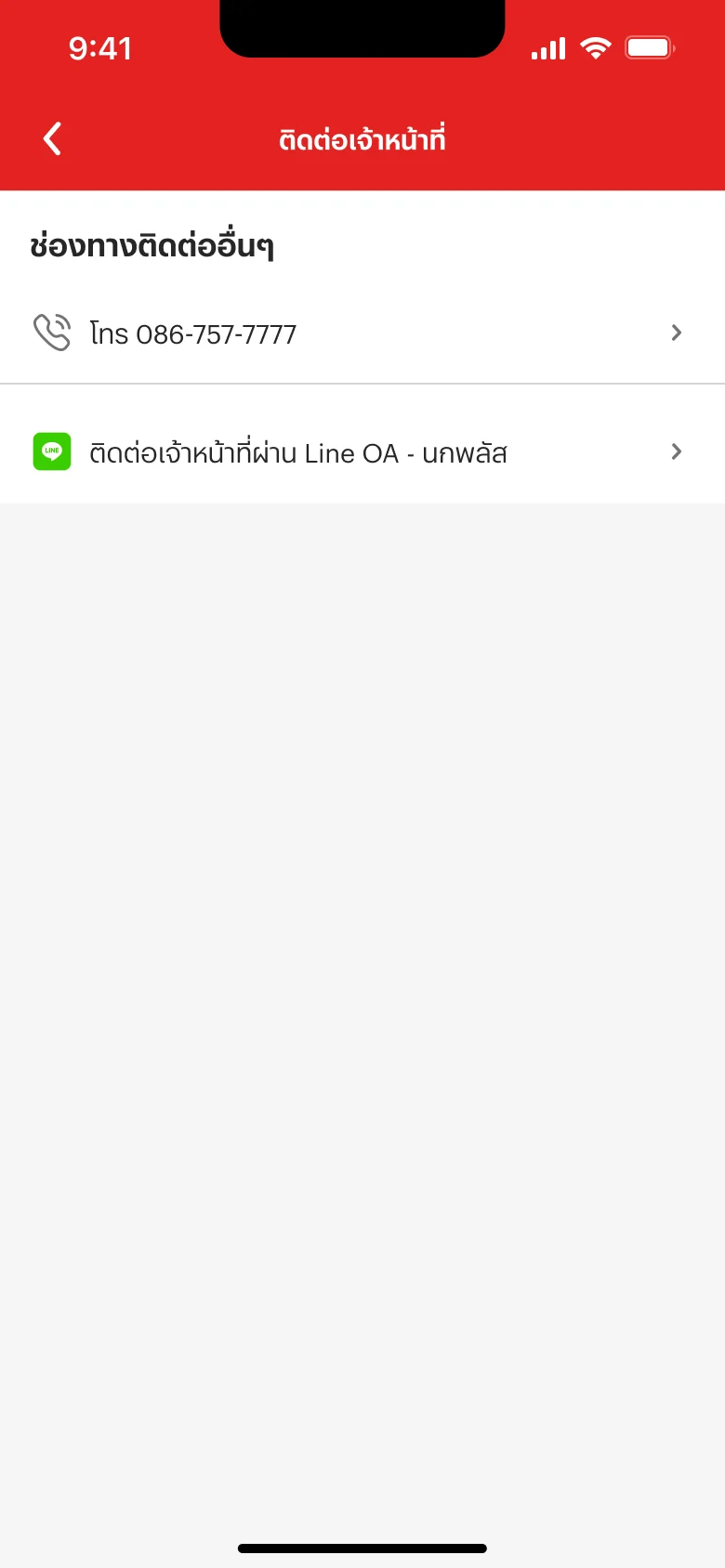
After: straight to staff on LINE, or callหลัง: ไปคุยกับเจ้าหน้าที่ทาง LINE หรือโทรได้เลย
No categories: one page with LINE first and the phone line belowตัดหมวดหมู่ออก เหลือหน้าเดียว LINE อยู่บนสุด ตามด้วยเบอร์โทร
Whyเพราะ With many topics, customers still tapped the wrong one; fewer choices are quicker to decide, and CRM voted for itต่อให้มีหลายหัวข้อ ลูกค้าก็ยังกดไม่ตรงปัญหาจริง ตัวเลือกน้อยตัดสินใจง่ายกว่า และ CRM โหวตแบบนี้
Instead ofแทนที่จะ Hide the help center altogetherซ่อนเมนูศูนย์ช่วยเหลือไปเลย
Every case goes to staff on LINEทุกเรื่องไปคุยกับเจ้าหน้าที่ทาง LINE
Whyเพราะ That's where CRM already works: one place for each case, nothing reported twiceเป็นที่ที่ CRM ทำงานอยู่แล้ว แต่ละเรื่องอยู่ที่เดียว ไม่ต้องแจ้งซ้ำ
Instead ofแทนที่จะ A form into a separate back officeฟอร์มที่ส่งเข้าระบบหลังบ้านอีกระบบ
Resultผลลัพธ์
Customers reach a person in one tap, and CRM handles each case once, in the tool it already uses.ลูกค้าถึงเจ้าหน้าที่ได้ในการแตะครั้งเดียว และ CRM ดูแลแต่ละเรื่องครั้งเดียว ในเครื่องมือที่ใช้อยู่แล้ว
Part 7ตอนที่ 7
Design System V.7
The organisation's first design system, starting with LotteryPlus.Design System แบบ global แรกขององค์กร เริ่มที่ลอตเตอรี่พลัส
Contextบริบท
A design system only works if the team believes in it, so I began there: I pushed for one, opened a vote, presented and advised, so that a global structure could take root in the organisation, starting with LotteryPlus. Then I set it up: three layers (primitive, semantic, component), one naming rule throughout, and 23 components rebuilt from V.6. Once it was steady, I handed it to the team and stayed on as their advisor.Design System จะเกิดได้ ทีมต้องเห็นความสำคัญก่อน ผมจึงเริ่มจากตรงนั้น ผลักดัน เปิดโหวต นำเสนอ และปรึกษาทีม ให้โครงสร้างแบบ global เกิดขึ้นได้จริงในองค์กร โดยเริ่มที่ลอตเตอรี่พลัส จากนั้นจึงเซ็ตระบบ 3 ชั้น (primitive, semantic, component) ตั้งชื่อด้วยกติกาเดียวกันทั้งระบบ และปรับ 23 คอมโพเนนต์จาก V.6 มาอยู่บนระบบใหม่ เมื่อนิ่งแล้วจึงส่งต่อทีม และเป็นที่ปรึกษาให้ต่อ
The system, liveระบบตัวจริง
One value, three layersค่าเดียว สามชั้น
- PrimitiveThe raw paletteชุดสีดิบ
- Semantic
colors/primary/defaultNamed for what it doesตั้งชื่อตามหน้าที่ - Component
btn-primary-background-rest
Semantic colours: 7 families, 5 steps eachสีตามความหมาย 7 กลุ่ม กลุ่มละ 5 ระดับ
- primary
- secondary
- tertiary
- status/info
- status/success
- status/warning
- status/error
23 components in 6 groups, refactored from V.623 คอมโพเนนต์ใน 6 กลุ่ม refactor จาก V.6
display 4- avatar
- icon
- logos-and-graphics
- graphic-banner
feedback 4- loading
- progress-bars
- toast
- tooltip
forms 7- button
- checkbox
- dropdown
- radio-buttons
- text-field
- toggle-switch
- lottery-image
layout 2- header
- footer
navigation 3- breadcrumb
- navigation-bar
- tabs
overlay 3- bottom-sheet
- modal
- line-noti
Spacingระยะห่าง
- sm · 4
- md · 6
- lg · 8
- 2xl · 16
- 5xl · 32
- 6xl · 40
- 7xl · 48
- 8xl · 56
Radiusมุมโค้ง
- none
- lg
- 2xl
- 5xl
- full
Type, in Graphik THตัวอักษร Graphik TH
- ลอตเตอรี่พลัส
- ลอตเตอรี่พลัส
- ลอตเตอรี่พลัส
- ลอตเตอรี่พลัส
11 feature pages built from it11 หน้าฟีเจอร์ที่ประกอบจากระบบนี้
- home
- search-lottery
- orders
- carts
- payment
- my-safe
- profile
- jidrit-lucky
- nok-shop
- register
- scan-check-lottery
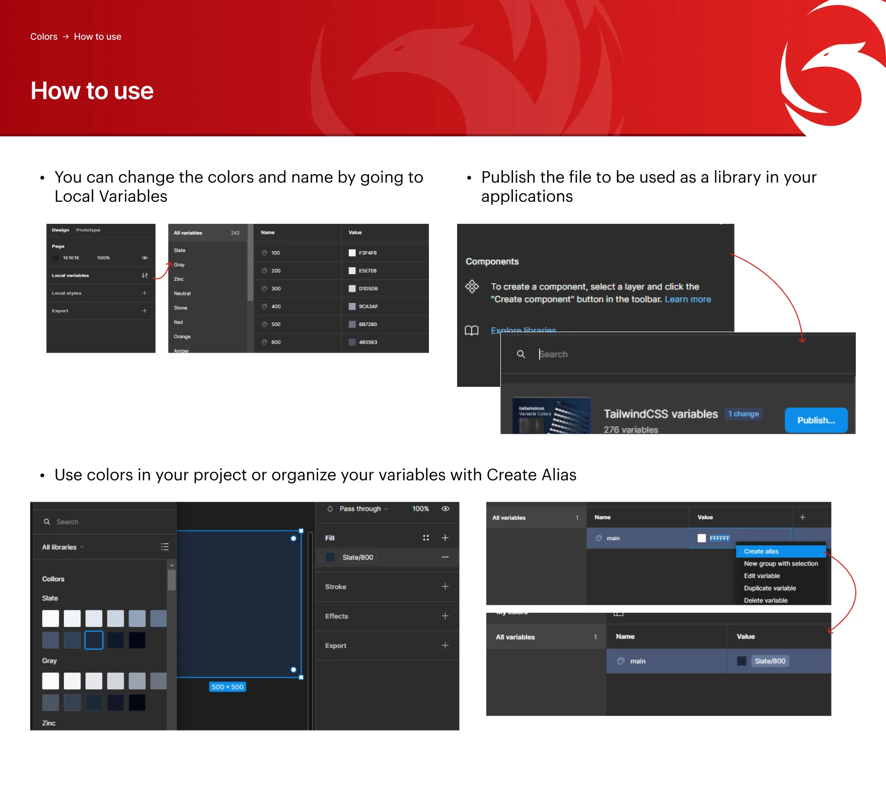
The how-to I wrote for the team: change a colour in Variables, publish the library, alias your ownคู่มือที่ผมเขียนให้ทีม: แก้สีใน Variables, publish เป็น library และสร้าง alias เอง
A closer lookดูใกล้ ๆ
Home page, final