
Poppa: Figma and code, always in sync.Figma กับโค้ด ตรงกันตลอดเวลา
Poppa's design system lived in Figma, and the app had drifted from it. In five days I built the bridge: one Storybook site drawn from the Figma file, where PM, PO, Design, Dev and AI tools all find the same answer, and a mismatch is caught before it reaches the app.ดีไซน์ซิสเต็มของ Poppa อยู่ใน Figma แต่แอปเริ่มไม่ตรงกับมัน ผมสร้างส่วนเชื่อมใน 5 วัน เป็นเว็บ Storybook ที่วาดจากไฟล์ Figma ตรงๆ ให้ PM, PO, ดีไซน์ นักพัฒนา และเครื่องมือ AI ได้คำตอบเดียวกัน และถ้ามีอะไรไม่ตรง ก็จับได้ก่อนหลุดไปถึงแอป
Design systemดีไซน์ซิสเต็ม · 7 Solutions · Ongoingดำเนินการต่อเนื่อง
- Toolsเครื่องมือ
- Screensหน้าจอที่ออกแบบ
- Design system
- Web
- Mobile app
The case, in a short filmเคสนี้ในฟิล์มสั้น
Poppa is an app for finding activities nearby.Poppa คือแอปหากิจกรรมใกล้ตัว
How I workedผมทำงานยังไง
Who did what, step by step. The highlighted lane is mine.ใครทำอะไร ในแต่ละขั้น เลนที่ไฮไลต์คือส่วนของผม
Who did what, a step a card: swipe through. The highlighted rows are mine.ใครทำอะไร ขั้นละการ์ด ปัดดูได้ แถวที่ไฮไลต์คือส่วนของผม
01The system in Figmaระบบใน Figma
- UX/UI designerนักออกแบบ UX/UIKeeps the system in Figmaดูแลดีไซน์ซิสเต็มใน Figma
- POWorking alongsideทำงานร่วมกันSteps 01 to 04ขั้น 01 ถึง 04
02The bridgeส่วนเชื่อม
- MeผมEvery value straight from Figma, behind six checksทุกค่ามาจาก Figma ผ่านด่านตรวจ 6 ด่าน
03The Storybook siteเว็บ Storybook
- MeผมOne site every role readsเว็บเดียวที่ทุกตำแหน่งอ่าน
04Reviewรีวิว
- MeผมEvery change sent for reviewส่งทุกการแก้ให้รีวิว
- DevelopersนักพัฒนาReview every changeรีวิวทุกการแก้
The whole pictureภาพรวมงานทั้งหมด
Everything I did on this project, one row each. Tap a row for the detail.ทุกอย่างที่ผมทำในโปรเจกต์นี้ แถวละเรื่อง กดเพื่ออ่านรายละเอียด
Everything I did on this project. Swipe through, tap one for the detail.ทุกอย่างที่ผมทำในโปรเจกต์นี้ ปัดดูทีละเรื่อง แตะเพื่ออ่านรายละเอียด
- Why Poppa needed a Storybookทำไม Poppa ต้องมี StorybookProblemปัญหาThe design lived in Figma, in code and in people's heads, and they disagreedดีไซน์อยู่ทั้งใน Figma ในโค้ด และในหัวคน และไม่ตรงกันWhat I didสิ่งที่ทำOne site that Figma, code and the docs all read fromเว็บเดียว ที่ Figma โค้ด และเอกสารอ่านจากที่เดียวกันResultผลลัพธ์One answer for PM, PO, Design, Dev and AI. No Slack threadคำตอบเดียวสำหรับ PM, PO, ดีไซน์ นักพัฒนา และ AI ไม่ต้องถามใน Slack
- One source, checked by machineต้นทางเดียว ตรวจด้วยเครื่องProblemปัญหาA value typed by hand drifts, silentlyค่าที่พิมพ์เองเพี้ยนได้ โดยไม่มีใครรู้What I didสิ่งที่ทำEvery value taken straight from Figma, behind six automatic checksทุกค่าดึงมาจาก Figma โดยตรง ผ่านด่านตรวจอัตโนมัติ 6 ด่านResultผลลัพธ์A mismatch is caught before it reaches the app. Each check was tested by breaking it on purposeถ้าไม่ตรง ระบบจับได้ก่อนหลุดไปถึงแอป ทุกด่านทดสอบแล้วว่าจับได้จริง
- It finds what eyes missเจอสิ่งที่ตามองไม่เห็นProblemปัญหาProblems in the Figma file only surfaced once they were in the appปัญหาในไฟล์ Figma จะเห็นก็ต่อเมื่อหลุดไปอยู่ในแอปแล้วWhat I didสิ่งที่ทำEvery token and component checked as it comes from Figma: contrast, missing states, values set by handตรวจทุก token และคอมโพเนนต์ตอนดึงมาจาก Figma: contrast, state ที่ขาด, ค่าที่ใส่เองResultผลลัพธ์61 findings for Design: 3 urgent, including the brand orange on every primary button61 ข้อส่งให้ทีมดีไซน์ 3 ข้อเร่งด่วน รวมสีส้มแบรนด์บนปุ่มหลักทุกปุ่ม
- Everyone reads the same pageทุกคนอ่านหน้าเดียวกันProblemปัญหาEach role asked its question somewhere elseแต่ละบทบาทถามคำถามของตัวเองคนละที่What I didสิ่งที่ทำA page for each question: where it stands, which token, which name in code, what to tell the AIมีหน้าตอบทุกคำถาม: ไปถึงไหนแล้ว ใช้ token ไหน ชื่อในโค้ดคืออะไร และจะบอก AI ว่าอะไรResultผลลัพธ์PM, PO, Design, Dev and AI tools reach the same answerPM, PO, ดีไซน์ นักพัฒนา และ AI ได้คำตอบเดียวกัน
- Always in sync, every change in viewตรงกันตลอด ทุกการแก้เห็นหมดProblemปัญหาA change on one side, Figma or code, went unseen on the otherแก้ฝั่งหนึ่ง ไม่ว่า Figma หรือโค้ด อีกฝั่งไม่รู้What I didสิ่งที่ทำFigma and the code side by side; every change shown before it goes in; every component compared with FigmaFigma กับโค้ดอยู่คู่กัน ทุกการแก้เห็นก่อนเข้าไปจริง และทุกคอมโพเนนต์ถูกเทียบกับ FigmaResultผลลัพธ์Who changed what, and where the two sides differ, is known on both sidesใครแก้อะไร และสองฝั่งต่างกันตรงไหน รู้หมดทั้งฝั่ง Figma และโค้ด
Part 1ตอนที่ 1
Why Poppa needed a Storybookทำไม Poppa ต้องมี Storybook
Contextบริบท
Poppa is 7 Solutions' own app for running, virtual challenges and everyday activities: find what fits your time and interests, track your progress, join alone or bring friends, and keep going without pressure or competition. It's how NokPlus, the LotteryPlus app, grows from customers into a community. The team's new design system existed only in Figma. Developers read values off it and typed them into code, which is how the drift started. People who don't use Figma couldn't find their way around it, and AI tools asked to build a screen guessed. An earlier catalogue had been turned down because it documented the old, code-first system. So this one starts from Figma, and treats it as the source. The system in Figma is the team's UX/UI designer's; my part was everything from there to code, built in the real repo without touching Figma.Poppa คือแอปของ 7 Solutions เอง สำหรับการวิ่ง ชาเลนจ์เสมือนจริง และกิจกรรมไลฟ์สไตล์ ช่วยหากิจกรรมที่เข้ากับเวลาและความสนใจ ติดตามความก้าวหน้า ทำคนเดียวหรือชวนเพื่อน และไปต่อได้โดยไม่ต้องกดดันหรือแข่งกับใคร เป็นทางที่นกพลัส (แอปของลอตเตอรี่พลัส) ขยายจากลูกค้าไปสู่คอมมูนิตี้ ดีไซน์ซิสเต็มใหม่ของทีมมีอยู่แค่ใน Figma นักพัฒนาอ่านค่าแล้วพิมพ์ลงโค้ดเอง ซึ่งคือจุดที่ทุกอย่างเริ่มเพี้ยน คนที่ไม่ได้ใช้ Figma หาของในไฟล์ไม่เจอ และเครื่องมือ AI ที่ถูกสั่งให้ทำหน้าจอก็เดาเอา แคตตาล็อกชุดก่อนถูกปัดตกเพราะไปบันทึกระบบเก่าที่เริ่มจากโค้ด ชุดนี้จึงเริ่มจาก Figma และถือ Figma เป็นต้นทาง ระบบใน Figma เป็นงานของนักออกแบบ UX/UI ในทีม ส่วนของผมคือทุกอย่างจากตรงนั้นไปถึงโค้ด ทำในโค้ดจริงของโปรเจกต์โดยไม่แตะ Figma
Who reads itใครใช้บ้าง
The screensหน้าจอ
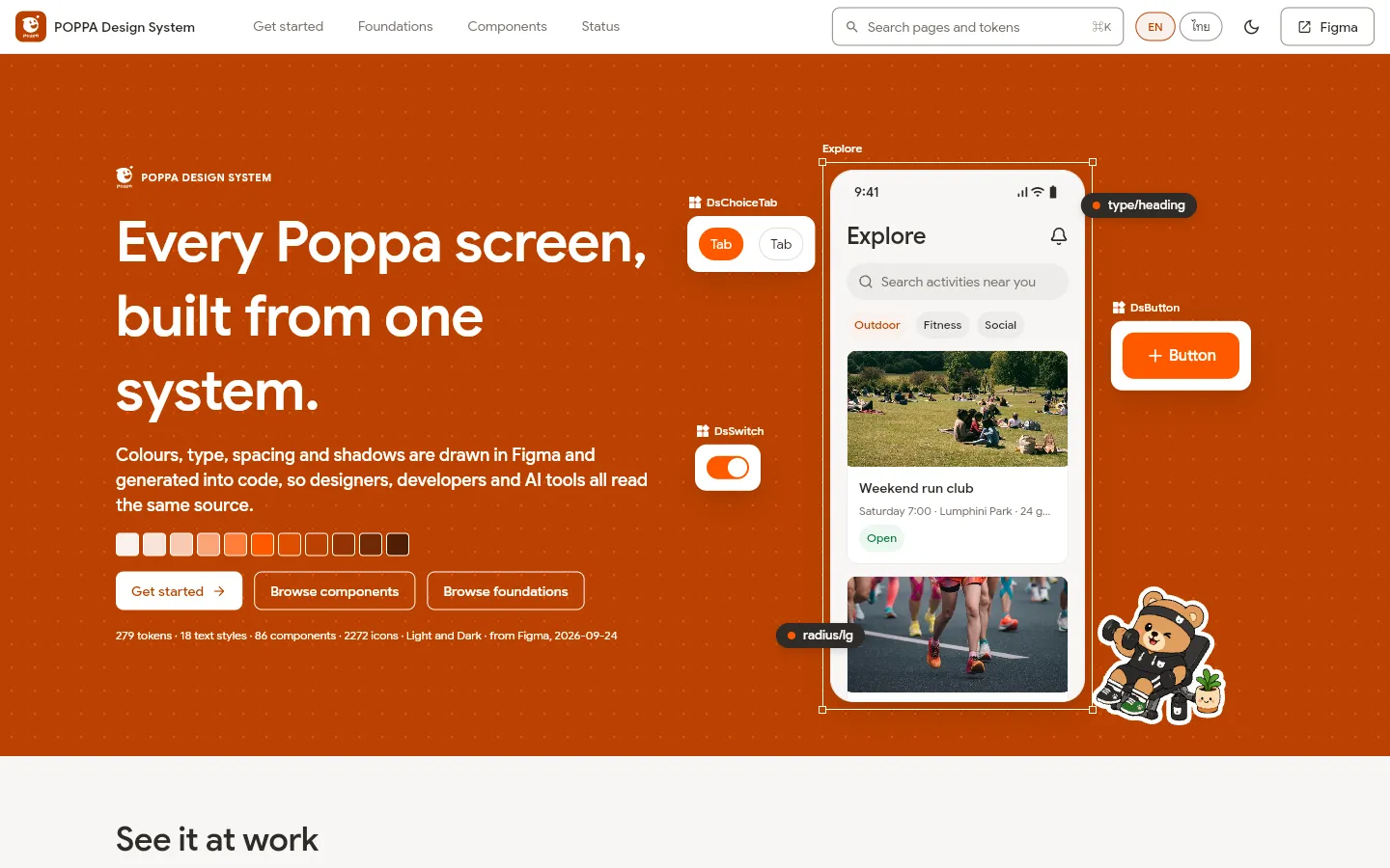
The site's front page: the brand, a Poppa screen made of tokens, a way in for each roleหน้าแรกของเว็บ: แบรนด์ หน้าจอ Poppa ที่ประกอบจาก token และทางเข้าของแต่ละบทบาท
Part 2ตอนที่ 2
One source, checked by machineต้นทางเดียว ตรวจด้วยเครื่อง
Contextบริบท
Figma's variables and styles are exported exactly as they are, and everything else is made from that one export: the tokens designers review, the values the app uses, and the catalogue the site shows. Nobody types a value by hand any more. Six checks keep it honest (an export edited by hand, the app's values out of step, a value the site shows that the tokens don't, a component that no longer matches its Figma layers), and each one was tested by breaking it on purpose.ตัวแปรและสไตล์ใน Figma ถูก export ออกมาตามที่เป็นจริง แล้วทุกอย่างที่เหลือสร้างจากไฟล์นั้นไฟล์เดียว ทั้ง token ที่ดีไซเนอร์รีวิว ค่าที่แอปใช้ และแคตตาล็อกที่เว็บแสดง ไม่มีใครต้องพิมพ์ค่าเองอีก มีด่านตรวจ 6 ด่านคุมทั้งเส้น ทั้งไฟล์ export ที่ถูกแก้ด้วยมือ ค่าในแอปที่ไม่ตรง ค่าที่เว็บแสดงแต่ไม่มีใน token และคอมโพเนนต์ที่ไม่ตรงกับ layer ใน Figma แต่ละด่านทดสอบแล้วว่าจับได้เมื่อจงใจแก้ให้ผิด
Where every value comes fromทุกค่ามาจากไหน
- 6
automatic checks, each proven to fail on purposeด่านตรวจอัตโนมัติ ทุกด่านพิสูจน์แล้วว่าจับได้
The screensหน้าจอ
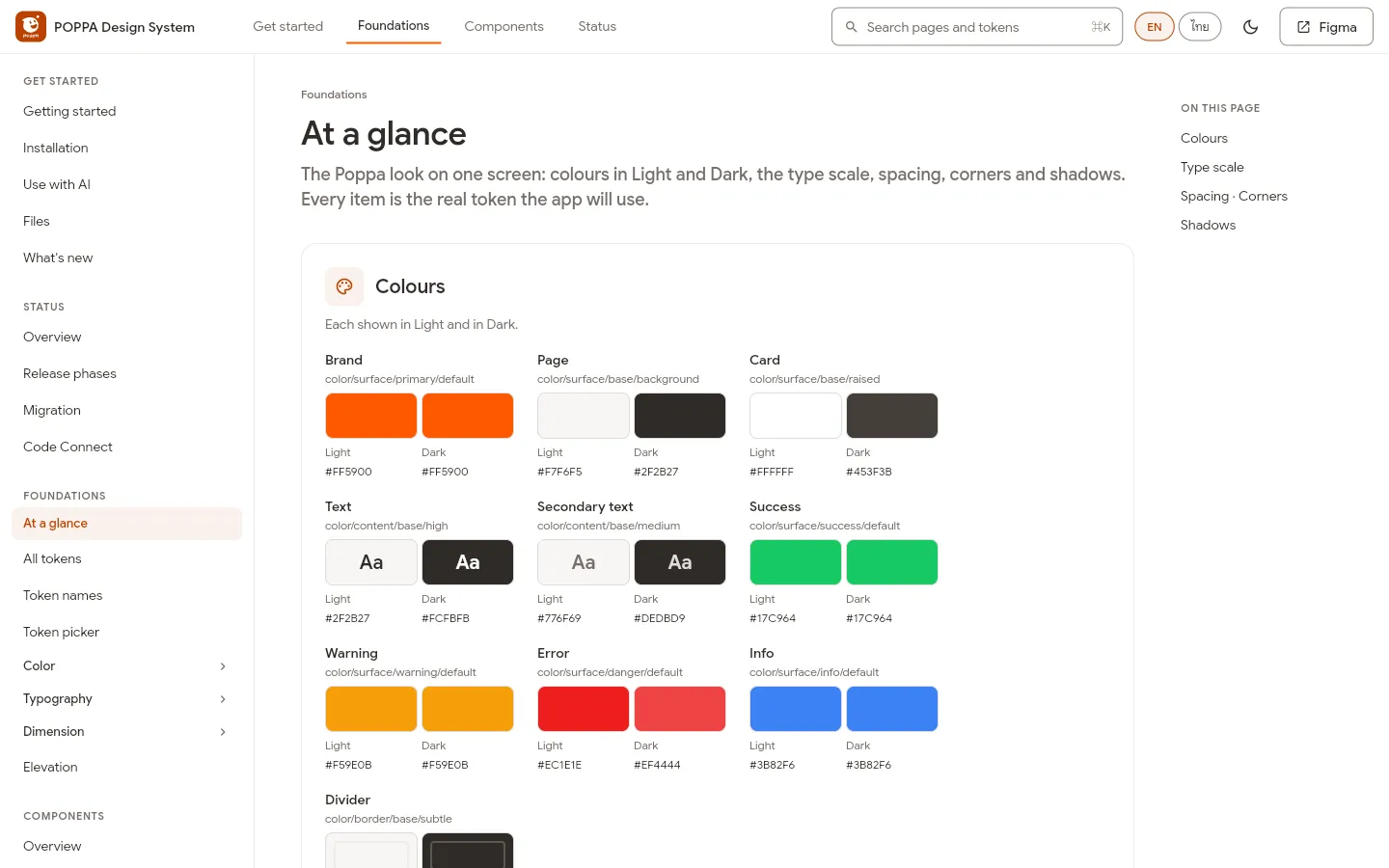
Every colour in Light and Dark, with the name a developer writesทุกสี ทั้งสว่างและมืด พร้อมชื่อที่นักพัฒนาใช้
Part 3ตอนที่ 3
It finds what eyes missเจอสิ่งที่ตามองไม่เห็น
Contextบริบท
Because the site draws the file exactly as it is, it shows what a review by eye misses. The brand orange, and white text on it, fail text contrast on every primary button and link. Placeholder text is too faint on filled inputs; the Danger button's label fails too. Buttons have no focus, hover or loading state; some controls sit under the 44-pixel touch target. Nothing was quietly fixed in code: each finding went to Design to decide.เพราะเว็บแสดงไฟล์ตามที่เป็นจริงทุกอย่าง จึงเห็นสิ่งที่การรีวิวด้วยตาพลาด สีส้มแบรนด์และตัวอักษรสีขาวบนสีส้ม contrast ไม่ผ่าน ทั้งปุ่มหลักและลิงก์ทุกจุด ข้อความ placeholder จางเกินไปในช่องกรอก ป้ายบนปุ่ม Danger ก็ไม่ผ่าน ปุ่มไม่มี state focus, hover และ loading บางคอนโทรลเล็กกว่าพื้นที่แตะ 44 พิกเซล ไม่มีอะไรถูกแก้เงียบ ๆ ในโค้ด ทุกข้อส่งให้ทีมดีไซน์ตัดสิน
- 61
findings sent to Designข้อค้นพบส่งให้ทีมดีไซน์
- 3
urgent: on every primary button, input and destructive actionเร่งด่วน กระทบปุ่มหลัก ช่องกรอก และปุ่มลบทุกจุด
- 18
decisions, each with its approverเรื่องที่ต้องตัดสินใจ แต่ละเรื่องมีผู้อนุมัติ
- 61
The screensหน้าจอ
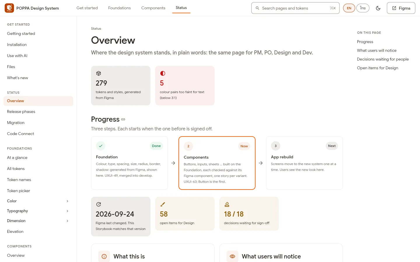
Status, in plain wordsสถานะ เป็นภาษาคน - Colour pairs too faint for text: found, not hiddenคู่สีที่จางเกินสำหรับตัวอักษร เจอแล้ว ไม่ซ่อน
- Three steps, each signed off before the nextสามขั้น ขั้นถัดไปเริ่มเมื่อขั้นก่อน sign-off
- What Design has open, what waits for sign-offงานที่ดีไซน์ยังค้าง และเรื่องที่รอ sign-off
Part 4ตอนที่ 4
Everyone reads the same pageทุกคนอ่านหน้าเดียวกัน
Contextบริบท
PM and PO read where the system stands in plain words. Designers pick a token by answering what it's for, one question at a time. Developers get the exact name to write, the same one they see in Figma's Dev Mode. AI tools get one setup prompt with the same rules: use these tokens, never a raw value, and ask when a token is missing. All of it in Thai and English, Light and Dark.PM และ PO อ่านสถานะของระบบเป็นภาษาคน ดีไซเนอร์เลือก token ด้วยการตอบว่าจะใช้ทำอะไรทีละคำถาม นักพัฒนาได้ชื่อที่ต้องเขียนเป๊ะ ๆ ตรงกับที่เห็นใน Dev Mode ของ Figma เครื่องมือ AI ได้ prompt ตั้งค่าชุดเดียวที่มีกฎเดียวกัน: ใช้ token เหล่านี้ ห้ามใส่ค่าเอง ถ้าไม่มี token ให้ถาม ทั้งหมดมีไทยและอังกฤษ สว่างและมืด
The screensหน้าจอ
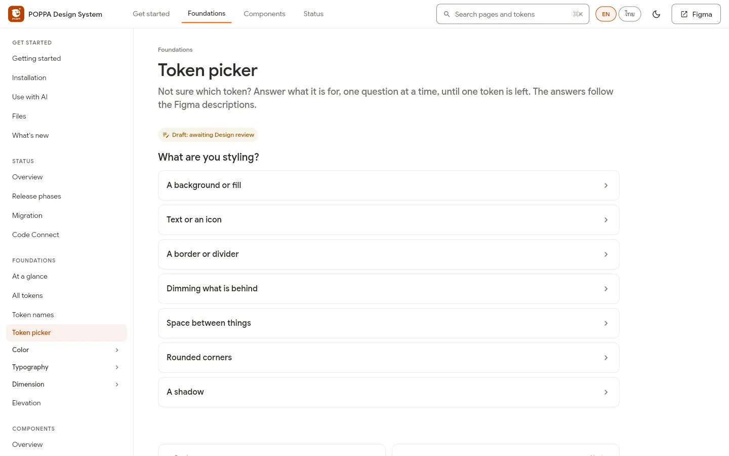
Designers: the token picker asks what it's forดีไซเนอร์: ตัวช่วยเลือก token ถามว่าจะใช้ทำอะไร 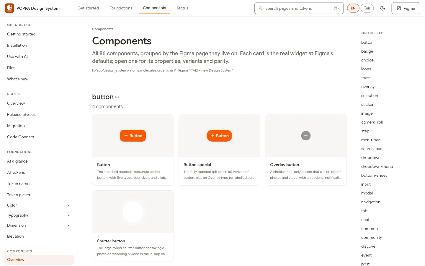
Developers: 86 components, each the real one from the appนักพัฒนา: 86 คอมโพเนนต์ แต่ละตัวคือของจริงในแอป 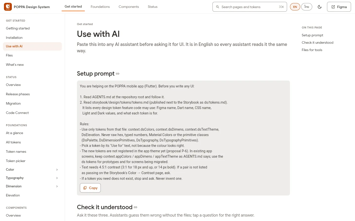
AI tools: one setup prompt, the same rulesเครื่องมือ AI: prompt ตั้งค่าชุดเดียว กฎเดียวกัน
Part 5ตอนที่ 5
Always in sync, every change in viewตรงกันตลอด ทุกการแก้เห็นหมด
Contextบริบท
These aren't screens I designed: they're here because they're drawn from the system. Figma's export sits next to the code made from it, so a change on either side shows up as a before-and-after, and each one goes to the developers to review. Every component variant is compared with Figma (its structure, tokens, Light and Dark values and size), and any difference nobody approved is flagged. And the work only adds, so the live app stays as it is while it moves onto the system.หน้าจอเหล่านี้ไม่ได้ออกแบบโดยผม ที่เอามาโชว์เพราะมันวาดจากระบบ ไฟล์ export ของ Figma อยู่คู่กับโค้ดที่สร้างจากมัน ไม่ว่าแก้ฝั่งไหน ก็เห็นก่อนและหลังเทียบกัน และทุกการแก้ส่งให้นักพัฒนารีวิวก่อน ทุก variant ของคอมโพเนนต์ถูกเทียบกับ Figma ทั้งโครงสร้าง token ค่าสว่างและมืด และขนาด ถ้าต่างโดยไม่มีใครอนุมัติ ระบบจะแจ้งทันที และงานนี้เป็นการเพิ่มอย่างเดียว แอปจริงจึงยังเหมือนเดิมระหว่างที่ทยอยย้ายมาใช้ระบบ
The screensหน้าจอ
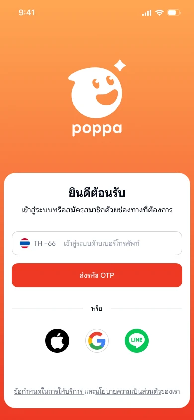
Sign in: phone, Apple, Google or LINEเข้าสู่ระบบ ด้วยเบอร์โทร Apple, Google หรือ LINE 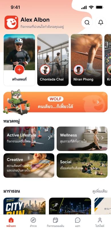
Home: stories, your character, categories, eventsหน้าแรก สตอรี่ คาแรกเตอร์ของคุณ หมวดหมู่ และอีเวนต์ 
Profileโปรไฟล์ 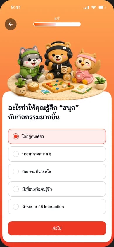
The character quizควิซหาคาแรกเตอร์